Inside the wild world of Cuphead
Cuphead was this year's video game underdog story. The brainchild of Oakville, Ontario-based Chad and Jared Moldenhauer, the extraordinarily visual 2D run n' gun adventure captured the world's attention on its debut at E3 a few years ago and hasn't let up since.
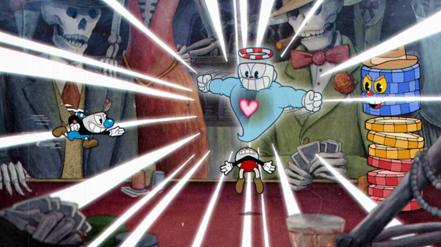
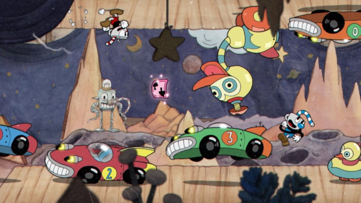
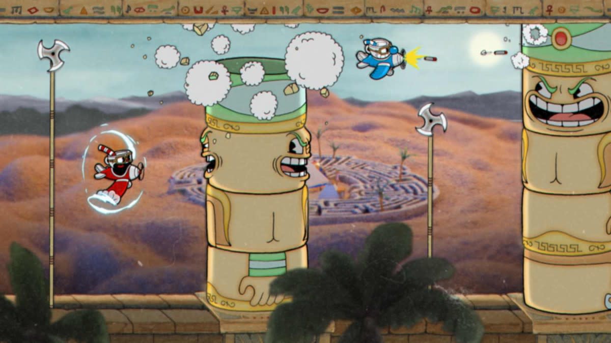
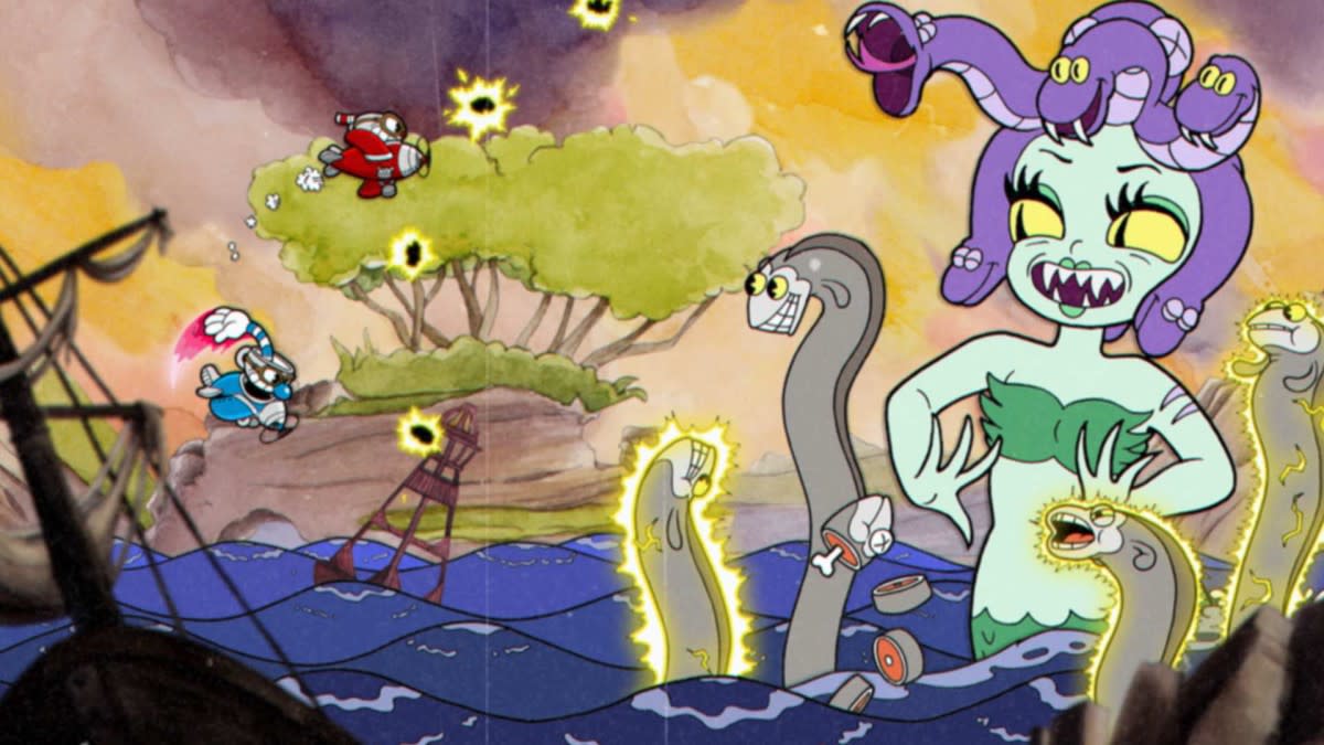
You could probably pin this down to its rapid-fire design aesthetic; inspired heavily by the surrealist cartoons of the 30s from the likes of Fleischer Studios and a VERY early Walt Disney. It's a spectacle to play, but a bigger one to produce: around 50,000 frames were hand-animated over four years to get the game finished. Thanks to a bit of financial help from Microsoft (who nabbed the title as an XBOX exclusive), the game found a huge following throughout its painstaking development. And since it's release last month, it's sold well over 1 million copies. We spoke to the founders to get deep in their world.
Can you talk about your background in art and design prior to Cuphead?
Chad: My background is 90% self-taught. Our Dad was a fine-artist; he went to school for it but never really followed it as a career path. When we were really young he was always drawing pictures for us, so I just always had this love of art, and then my past job before jumping into this Cuphead adventure was running a small web design and marketing company. So that lends itself perfectly to this whole self-taught way of art I've lived through; self-taught design and typography and everything as I grew through the business. It's always been in my blood.
Did that experience lead itself to this project?
Chad: Not really. Jared and I have always had a love for 30s cartoons, but I'd never sat down and drew them or had an interest in drawing them, as funny as that seems. So this project is what really drew out some of that, I guess you could call it 'skill'.
Were there any fundamental design decisions made before you had even chosen a style?
Chad: Really early in the project, we knew we were going to go all in on this 'golden era of animation'. We both knew we wanted to keep very true to how cartoons were made back in that era. It's the very fibre that holds this project together from every aspect, and that brute-force method is what we followed for everything. That's what made the original reference material really stand out from other attempts in the past, and looking back (in video games especially) no one has really tried to bring this style to the same effort that we've put into this game, so that was set in stone.
Jared: It was combining two things we loved: video games and 2D art, and from there it came together. There are so many different possibilities and once we saw the potential and how wonderful it looks, we knew we had to go with it. I also think it's something lots of people had as a child. When playing a game you put that interpretation on it as if you're playing a cartoon. But then, as time passes, you grow older and realise it's not quite the same, they're two different things, then you think how amazing it would be if someone took the time and made a game purely with an animation aesthetic.
The fact Cuphead is a success just cements the idea that traditional hand-drawn animation is something we can keep pursuing for a while.
Chad Moldenhauer, Studio MDHR
I loved in another interview you said that (with this particular animation style) you weren't limited by realism. How do you even start to concept out what you wanted with no creative parameters?
Chad: It was pretty easy because we wanted to land on something we'd both love. Even when the game was of much smaller scope, we knew we wanted to be in love with it before we started working on it. Coming up with a style wasn't too crazy or a stretch for the likes and dislikes, but after we decided the style we reached for references of games, films and animation from the era that we loved. We played with the things that really resonated with us, without worrying about like 'hey is this a character that feels exactly like something from the 30s?'.
Jared: We also liked similar things. When you have two different ideas but the same goal in mind it becomes easier. For example, if you've decided vegetables are going to be in as a fight, we can bounce back and forth off each other very easy to set a tone, and say 'how do you make the giant carrot just a little bit crazier'. Having severely talented artists helps as well to expand on something like that.
In the design process, the idea of a character was never known instantaneously. You knew what the pattern was going to be, then you'd have to think of 'what would be a weirder, more creative way to make the attack came out'. I don't think anything was necessarily a struggle, it was more fun when you're open-ended to have anything as a possibility. And anything can get a little weirder or darker, while still maintaining the overall happy vibe of the 30s.
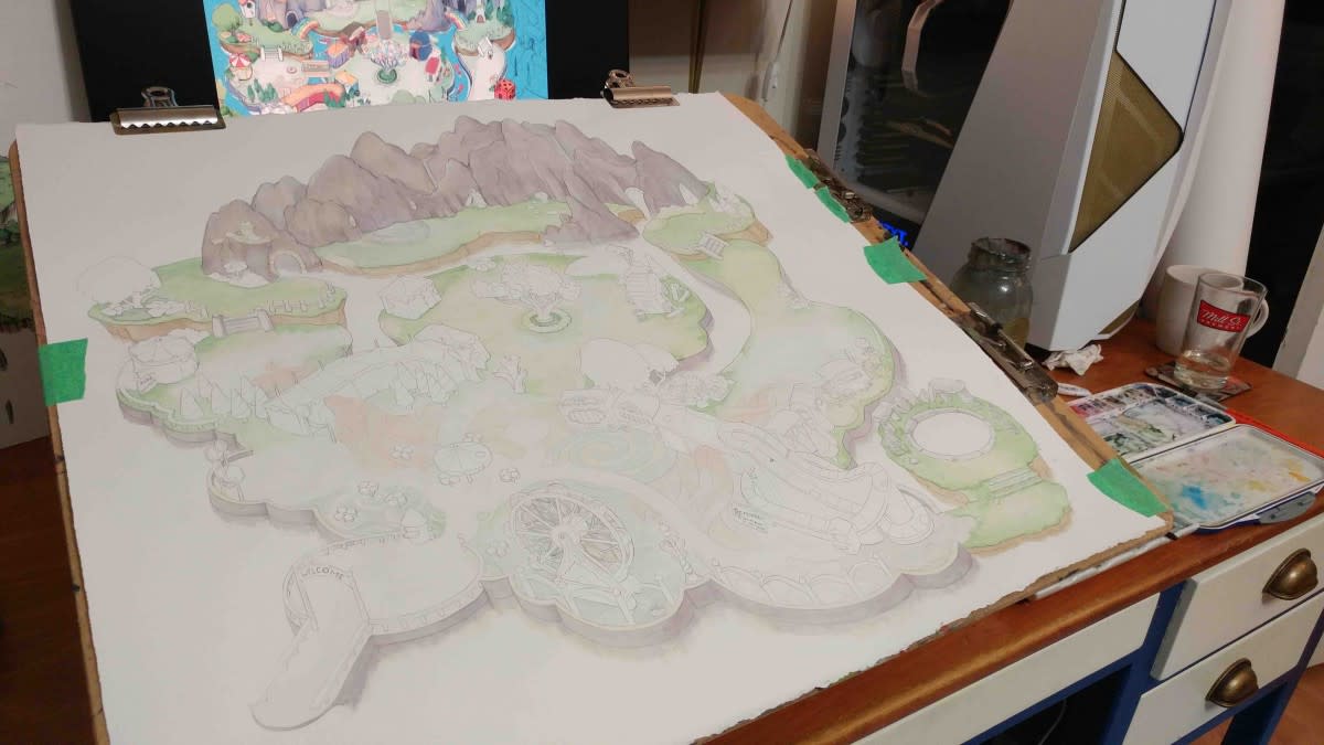
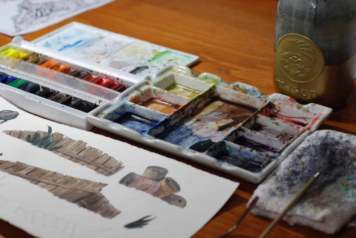
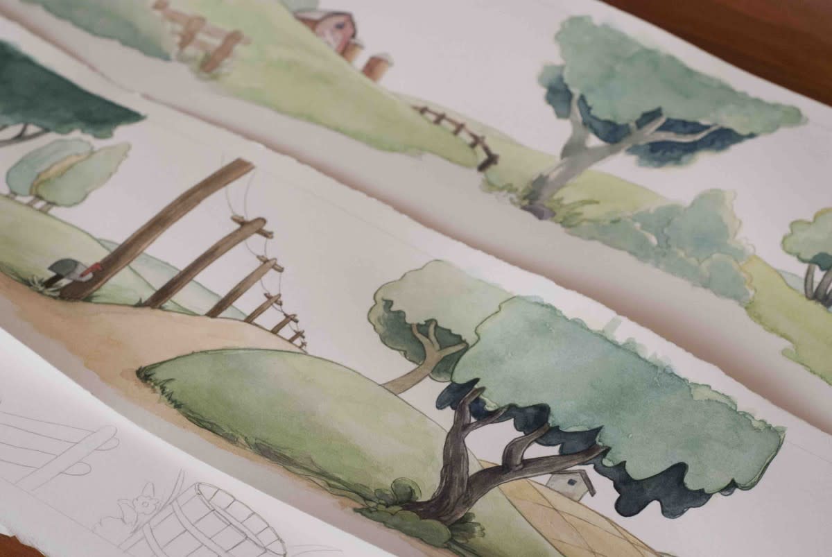
We stayed away from digital for everything, even the screen effects are actual scans from used film reels.
Chad Moldenhauer
Chad: I think one of the main things which helped the game wrap up and align with how they made cartoons in that era, was that we didn't get too hung up about perfecting anything 100%. Once we had a carrot that looked crazy enough we made a few refinements so it suited the era a little better – that's it.
Can you talk about what those adjustments were?
Chad: We never designed a 'bible' for what things needed to look like, which sometimes was a bit troublesome for our artists, but Jared and I always had the details in our head and went via our gut. So a lot of things would be like – say if the pupils of a character didn't feel right – we'd reference a few cartoons that we really liked and would suit certain character designs. Or if their proportions would feel too close to realism it would start to feel like a modern style, so we'd refine that. It really was about going via our gut about what felt wrong or right or what needed more emphasis.
Jared: Watching cartoons daily and keeping it in your brain as a concept helped us see the nuances. The 'correct' path would be to have the bible written and saying 'here is your style guide' instead of 'when it's almost there we'll glance over it and give you notes' (laughs) but that's the way it worked and it turned out exactly how we wanted, so I'm really happy. But maybe on the next game, we'll consider a bible...
It was quite a small team, right? Were you all in the same room eyeing off each other's work?
Chad: No, that's the whole thing. Everyone was remote. So nobody was seeing anyone else's work in real-time which was the whole catch-22.
Jared: It somehow just worked out beautifully. We used some online project tools and collaboration tools where artists could share their concept art and pencil-test animations very fast and it kept it organised online for us, so there wasn't any email back and forth from the beginning. It actually kept the process moving along really fast.
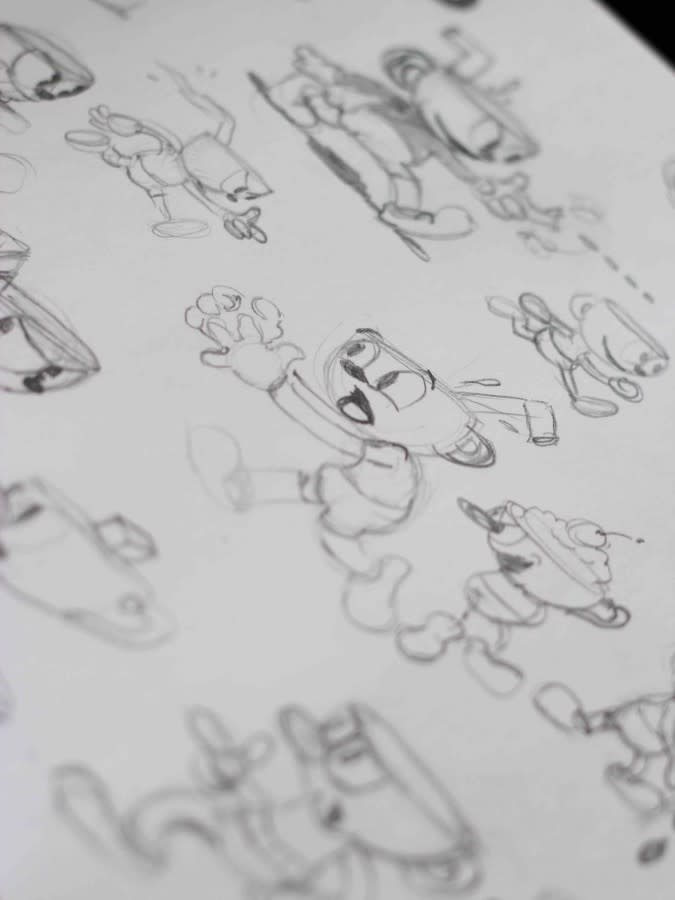
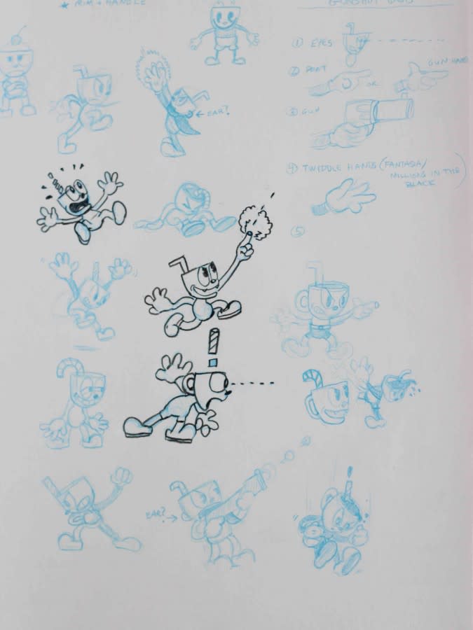
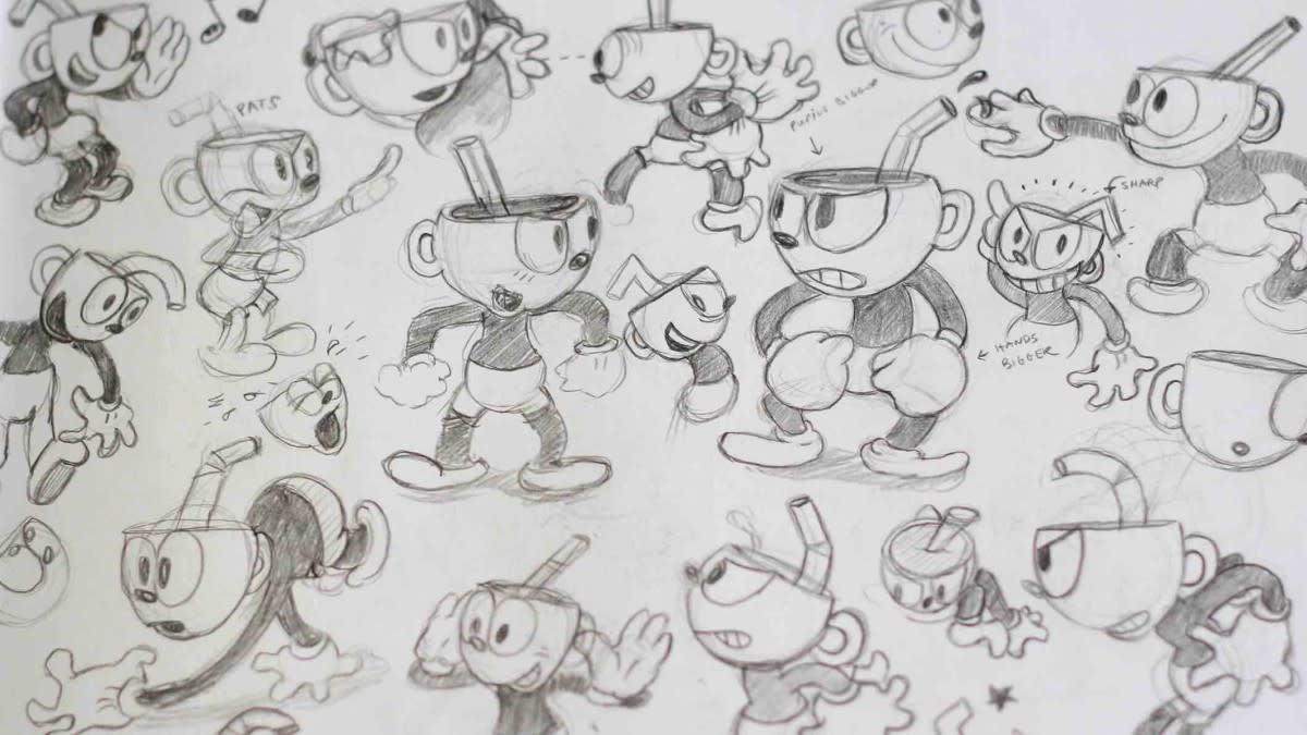
Can you talk about the process of getting a character from a rough idea to a playable figure?
Chad: Everything starts at a concept phase. It might be Jared or myself sending some really crude sketches to an artist with a very high-level idea. For example 'we're going to have 'The Root Pack', and there will be a potato and a carrot but we're unsure of the 3rd boss', so we'll bounce back with the artists, and they'll come back with ideas.
Once that concept phase is fleshed out and we know what we're doing, we would go into the actual animation with rough passes, so we'll figure out the flow of how each boss or enemy is going to work out in the game, then work backwards from there – what was the best animation to start with, etc. Once that starts flowing, we'd be constantly churning out animation every day with barely any fine-tuning. Again, following the path of the artists in the 30s we didn't try and make sure anything was massaged to be a perfect animation, there was a lot more energy in the original 30s animation, and we tried to keep true to that by not picking apart everything so diligently.
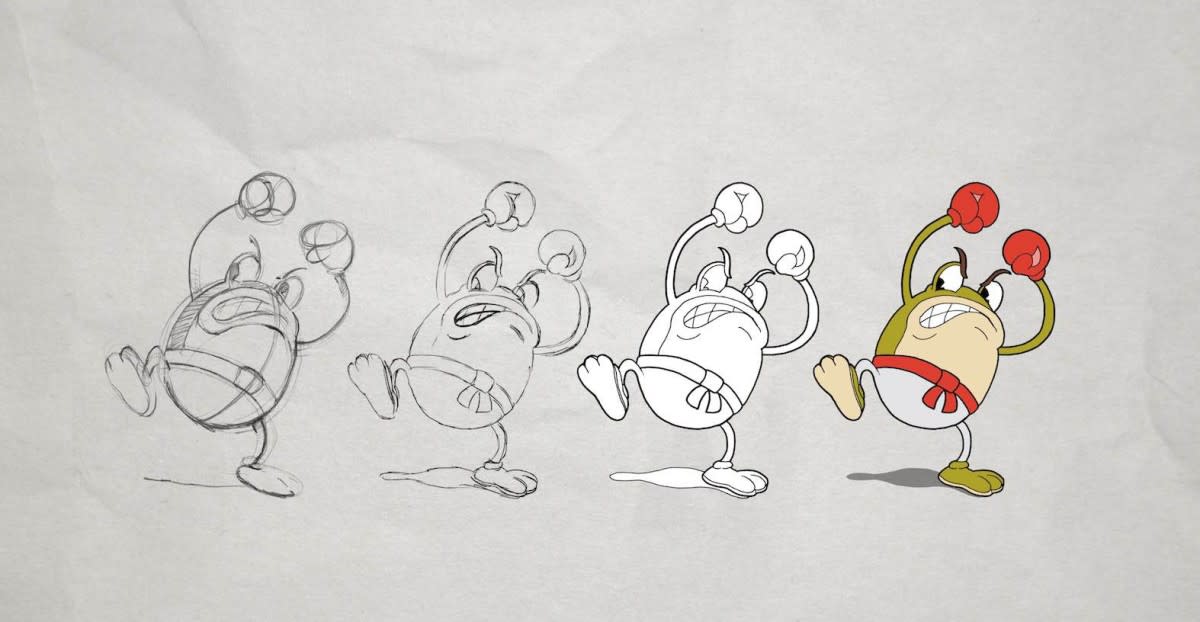
Once those animations wrap up, we move onto the inking process, where we ink everything on a brand new piece of paper, which gets scanned into the computer so it's in digital form, and we colour it on the computer digitally. The reason we did that (as opposed to the 30s method of inking on celluloid then painting on the back of it) is that we were crazy enough to make that test and put them side-by-side by colouring the inked final product vs inking on a celluloid, and when we inked it in the game you couldn't tell the difference. We chose the lesser evil to ensure we could finish on time.
We never really designed a bible for what things needed to look like, which sometimes was a bit troublesome for artists. We just always had the details in our head and went via our gut.
Chad Moldenhauer, Studio MDHR
After that's done, we still have to make an animation chart to pass on to the development team. They don't just throw all the animation in the game, it still has to adhere to what the original animators planned: Holding on certain frames, or jumping back on different loops within a set of frames to ensure the animation was as planned.
There are also so many extra animations required for playable 2D art, plus all the extra effects like the smoke of a gunshot or an explosion. Did these snowball on you, or did you know they would need to be done too?
Chad: We always knew we'd need secondary actions and effects. If a certain boss was to attack in a certain way, we had to make sure that animation was set up so it could cut right to the attack animation from any frame. Then from the effects side of things, we kept the crazy mentality that about 90% of the game's effects are all original. So when the potato spits out his attack, a bit of dust and smoke comes out of his mouth – that's never re-used in the game. The next thing that spits something out from you, we drew an original smoke or spit effect on top of that.
I just see the independent game scene as the real avenue to foster experimentation and try new things, and if it catches on it can filter upwards.
Chad Moldenhauer, Studio MDHR
I also read you used a lot of looping animations as both a response to the source material and a convenient way to keep things moving. Were there any other tricks you used to keep the production on track?
Chad: The other big thing that helped us was, considering the style of video games we referenced, the boss repeats certain attacks. So you're not drawing animations for a 5-minute long fight, you're making a shorter clump of animation which you can use and repeat as the fight goes on. So that and the background loops were the main saviours from endless frames of animations.
Did you end up breaking any of the rules of the source era?
Chad: I wonder. Did we?
Jared: Other than the colouring, not really.
Chad: We were really picky about a lot of the stuff we did. Just an off-the-cuff example, if someone said 'hey here's the fire and flames we want to make' – if it didn't feel right, we'd go and watch the films that had fire and we'd go 'ok, can you massage the shape so they look a little closer to this, and add a few frames because it's not as smooth as some of the cartoons', so it's constantly pruning to ensure everything that was animated in the game would still fit in the era.
There is also so much design beyond the gameplay, like the typography and menus. Was that all you guys too?
Chad: That's just the other side of my craziness. When we chose the style, both of us loved the animations and the colouring and how the backgrounds were painted in watercolour, but one of the main things I had in the back of my mind was to ensure everything in the game fell within the era. So we created custom fonts based on comic books and film titles and other things from the era. We looked at a lot of stuff: for the equipment menu in the game we looked at old baseball cards, old children's toys and packaging, even the basic rule that if something was meant to be centered it was never centered perfectly because they weren't using digital means to measure it, they were just placing things on their template by hand.
For certain fonts, we'll sometimes have 4-5 different types of the same letter within the font, so in the game when you're looking at some of the NPCs talking, or any other on-screen text, if you see 3-4 keys within the text they all look different. That was on purpose because we wanted it to look hand-drawn every time the text popped up.
Jared: When you're going all-in on something you want to make it as beautiful as possible. So if you're going to make the animations perfect, and you're going to hand-draw the backgrounds, and record a live jazz soundtrack, you should do the fonts right as well. It's one of those things that died over time, the amount of font-work that used to go into these productions. There's also something so distinct about looking at a game like Galaga, whereas a large portion of box art is a second thought – you slap it together, use the same fonts you used in the last 40 games and you've got a package. Think about movie posters, even low budget movies had artists doing the font work and painting this beautiful picture for a movie that may have been horrible. There was such a willingness to put art into every aspect of the project, so it seemed like something you couldn't skip while making Cuphead.
I'd love to hear your thoughts on the role of video games in propelling design forward.
Chad: It's tricky. The independent scene is a bit easier because there are no shareholders to please and there aren't $20m-$100m budgets on the line. As games get bigger, and as you lean towards AAA, it is actually harder to step away from what is traditionally selling or focus-tested to be the most likeable style in a game. Which is kind of sad, but it does make sense from the business side of things. I just see the independent game scene as the real avenue to foster experimentation and try new things, and if stuff catches on it can filter upwards towards the larger video game companies.
Jared: For some of them, if you have the movie and budget to make that game, maybe we can just spend a little extra money aside to make that box art a bit better.
Chad: Yeah but how do you buy your yacht?
Jared: That's the whole debate.
Were there any fundamentals you learnt that you will take to your next game?
Chad: The one thing is to stay true to your vision. There are easier ways to do things within a style, but stay true to the style even if it means more work. The fact Cuphead is a success just cements the idea that traditional hand-drawn animation is something we can keep pursuing for a while, which is one of our dreams. To make games and be true to our love of animation.