Midsommar: Designing the nightmare
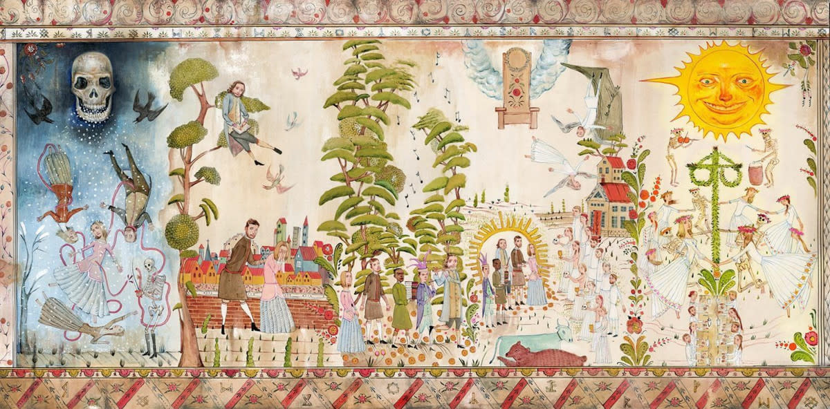
Ari Aster is demanding you pay attention to the details. It's an inquisition that began with Hereditary — a familial-nightmare so driven by external forces that it made fate a paranoid subject — and continues with Midsommar, a folk-tale so prophetical that one can determine the plot within its first 15-seconds (if you're looking closely enough).
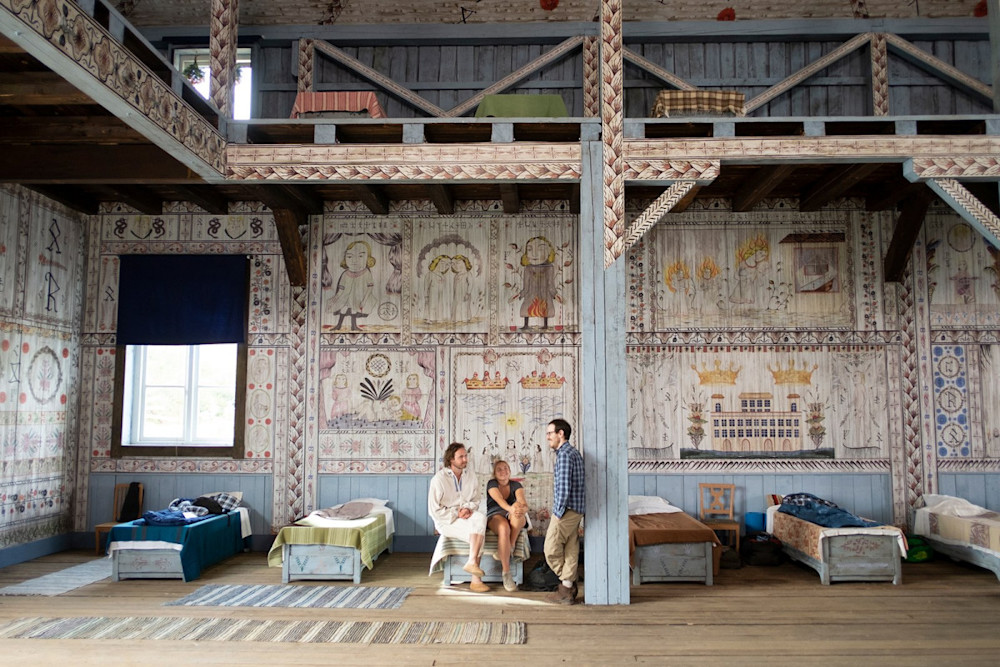
Like any single-setting horror film, the Swedish commune of Hårga starts idyllic prior to interpreting its own nightmare. But the Hårgas are complicated antagonists; victims of own their warped traditions as much as their doomed visitors. In this respect, their visually-rich legacy — of runes, tapestries, panels and archives — are villains in their own right, a product of warped groupthink hiding behind some of the most consequential graphic design in recent film history. Its scale would be impressive, if it wasn't for the blink-and-you-miss-it terror of the world it lives within.
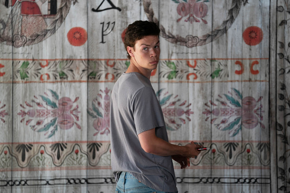
Designer and art-director Nille Svensson was responsible for much of this complex material, interpreting a rich mythology (created for the film) and real-world traditions into dense graphic artistry that has left audiences arguing even months after the curtains closed. Here, we go deep on the symbolic design layers of a beautiful nightmare.
Spoilers for Midsommar to follow.
What was your reaction to seeing the finished film for the first time?
I think I was as surprised as anyone else. It was like seeing a favourite book turned into a film. I had studied the script extensively over and over which is kind of a literary journey. You 'compose' a movie in your head and make all these little conscious and subconscious micro-decisions about what you believe to be the story and how it could be told. I even composed a little piece of folk-horror music to set myself in the right mood. In the finished film, those preconceptions I had were all jumbled up.

So my first reaction was like ‘wow, I didn’t see that coming’ because things weren’t as I had imagined them. Then I was amazed that a director could make a movie that even surprises someone who is involved in the making of it. The script is so rich with aspects you can pick up on, but some parts of the story will affect you more personally than others. Working with this feature film made me very aware of this. The script wasn't really 'instructions' on how to make a movie, it is more like a seed and more or less anything could grow from it. I also realised that film is much more tangible even after all the scenes are shot. Editing, scoring, sound design, grading etc. Film is like soft clay all the way until it reaches the audience, and even then each and every spectator will take something different away from it. This became very clear to me after seeing the finished film then while I was working on it. In the film project I'm involved in at the moment, I champion the thought that the script isn't holy, that everything is working material. And working with Midsommar really helped me understand that.
Henrik (Svensson, production designer) has referred to the film as a protest against anti-nationalist Swedish politics, from the narrative to the way colours like yellow and blue play prominent roles within it. Was that part of the design brief to you or was that developed by the local team?
Henrik, Ragnar (Persson, who painted the murals) and myself had a very specific interpretation of the Hårgas and what they represent, but as you say there are a lot of different interpretations you can project your ideas on to. To me one of the film’s major themes is what happens when groupthink gets out of hand, which definitely can be seen as a comment on any type of totalitarianism. But I think what makes Ari a compelling storyteller is that he doesn’t make that instantly clear. Even after viewing the terrible fate of all these poor Americans (the script was a lot more gory than the film), I don’t think the Hårgas are ”evil” in a classical horror movie meaning of the word. It’s an intelligent presentation of how they organise their society and human life in a way that has (a lot of) nasty side effects but in a strange way is coherent and excusable to them, and therefore strangely enough for us too, at least as long as we are unaffected bystanders. Here I think that there is also a strong comment on the interesting difference between ”anthropological” culture and lived culture which I think has been a bit overlooked in the reception of Midsommar.
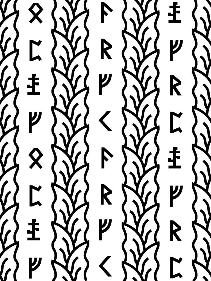
But there is also this idea in the film of being an outsider and having your fate decided by your ability of assimilate. The Hårgas seem to profile every visitor and those that are deemed to be unable, on quite loose grounds, to assimilate are murdered. This is clearly a kind of fascist-nationalist reasoning. And although that wasn't part of the brief, there is visual symbolism in the film to make that interpretation possible. Take the murals for example: The Hälsingland decorative paintings are something you (as a Swede) grew up with even if you don’t live in that part of Sweden; they’re like a Swedish national treasure. The same goes for the use of runes which come from Scandinavia and were revived by the nationalist movement of the 19th century, a movement that largely created the idea of the 'Viking' era. So these historical paintings, using runes and adhering to an idea of the 'glorious' Swedish past, and the current rise of far-right movements in Sweden were all referenced in the film.
I had an initial problem with using runes because I thought it was a bit 'too obvious', but for the rest of the world I guess runes is more a general symbol of things like fantasy or cults or magic; it is a very effective artistic tool so to speak, so in the end I didn’t mind following that tradition. We knew it was important to consider the global audience and not hold back out of concern for how Swedes would see it. It made that interpretation possible, but it was one of many.
Graphic elements play a really important part in the film’s narrative, starting with the opening shot and extending to the tapestries and murals of Hårga. Was that clear to you?
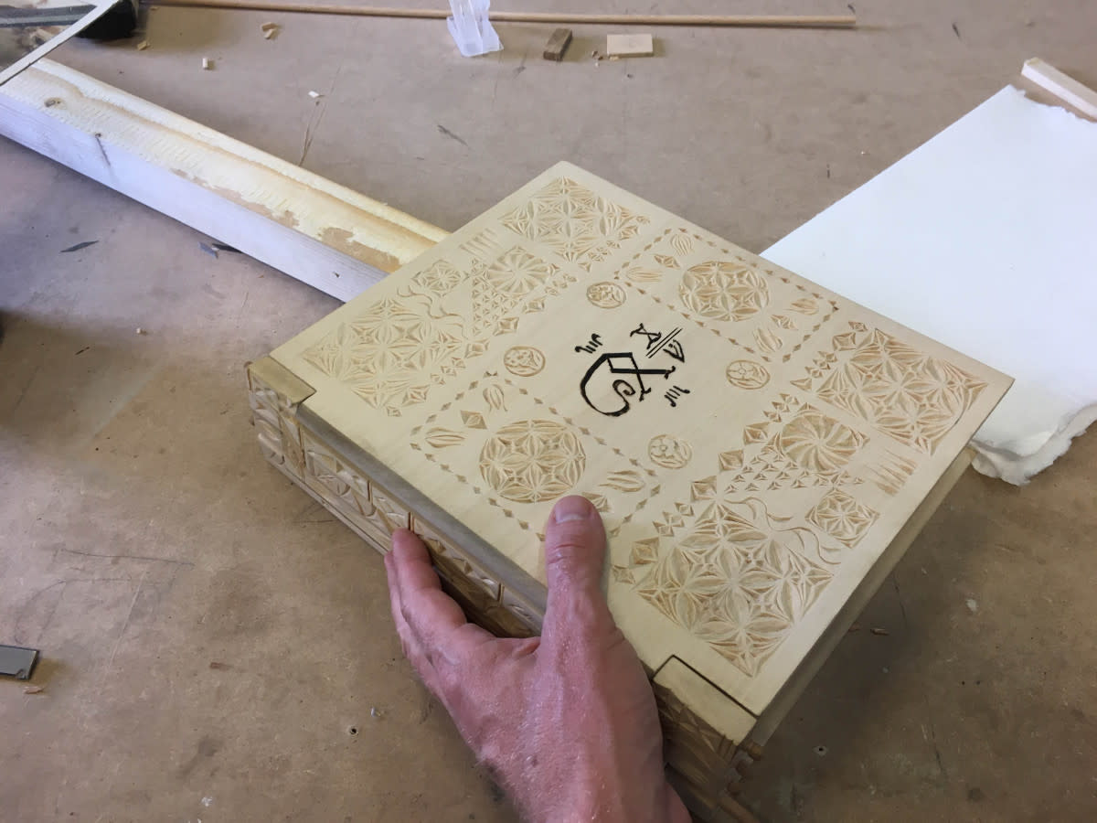
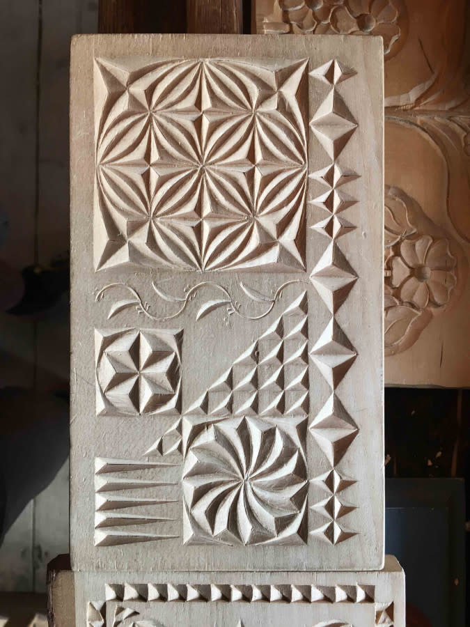
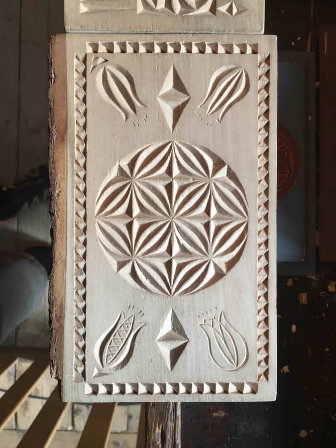
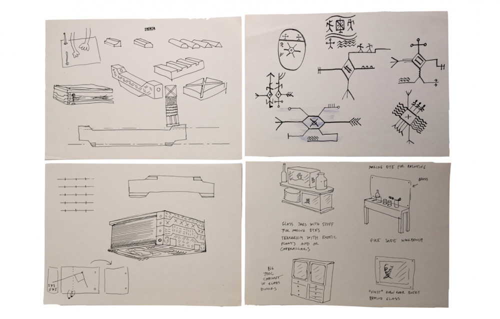
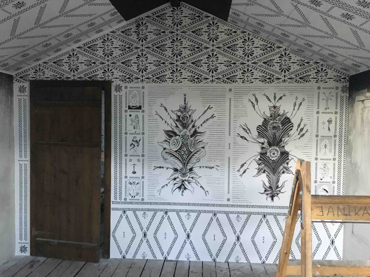
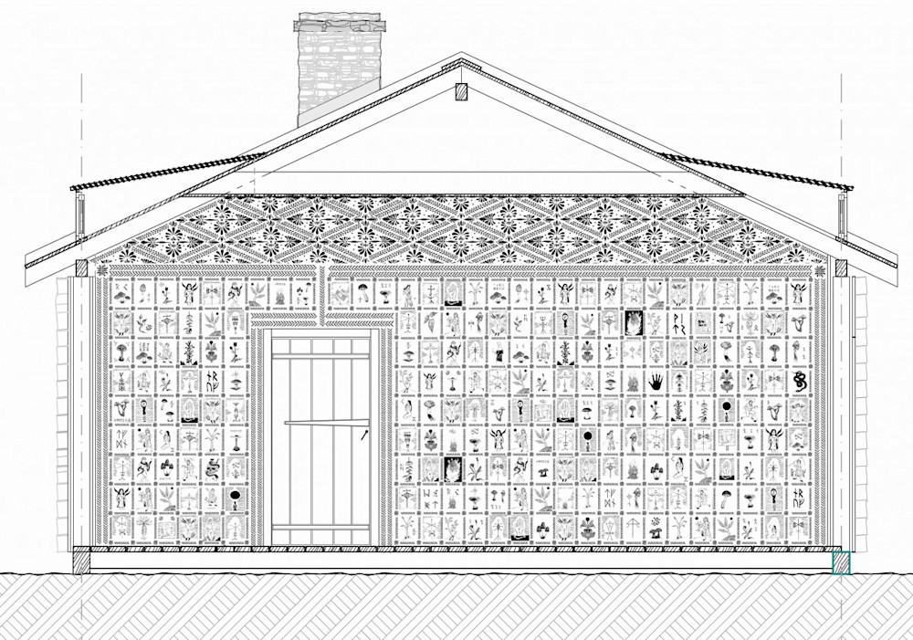
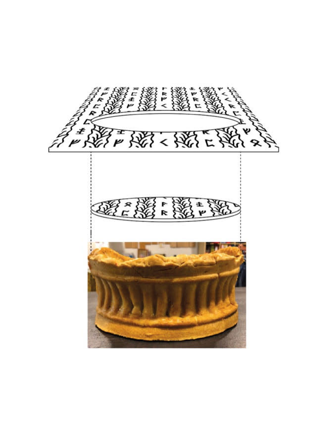
Henrik spent literally years creating a look-book for the film and the script was more or or less finished when myself and Ragnar got involved. But all the script says is “in the big house, there are murals describing the Hårgas history and mythological beliefs” so we had to work that out together. I was very much brought into the project to make the tapestries and murals effective and believable and it is there I put most of my effort, although I worked with a lot of other stuff, like the Radr-book, interiors for the temple, food, clothing ornaments, runes etc. But the murals were really the thing that Henrik wanted us to 'solve'.
Before we started I went online to research Ari’s creative history and found a YouTube clip where someone analyses the trailer for Hereditary, which was just premiering at the time. The person in the clip was stopping the trailer every five seconds, freeze framing, zooming in and saying things like "notice how the model house has three windows while the real house only has two” and stuff like that. So I was like ‘shit, this is the kind of audience we’re facing here’. And I love that kind of fandom verging to obsession — who doesn't. It just meant the mission for us was to push even more easter eggs into the film. I think Ari is a director who is very good at setting that kind of positive feedback in motion. I guess every artist wants an attentive audience, but that's something that takes nurturing, it doesn't come for free. And it is rewarding to follow the discussions online now, we all poured so much into the project to be discovered.
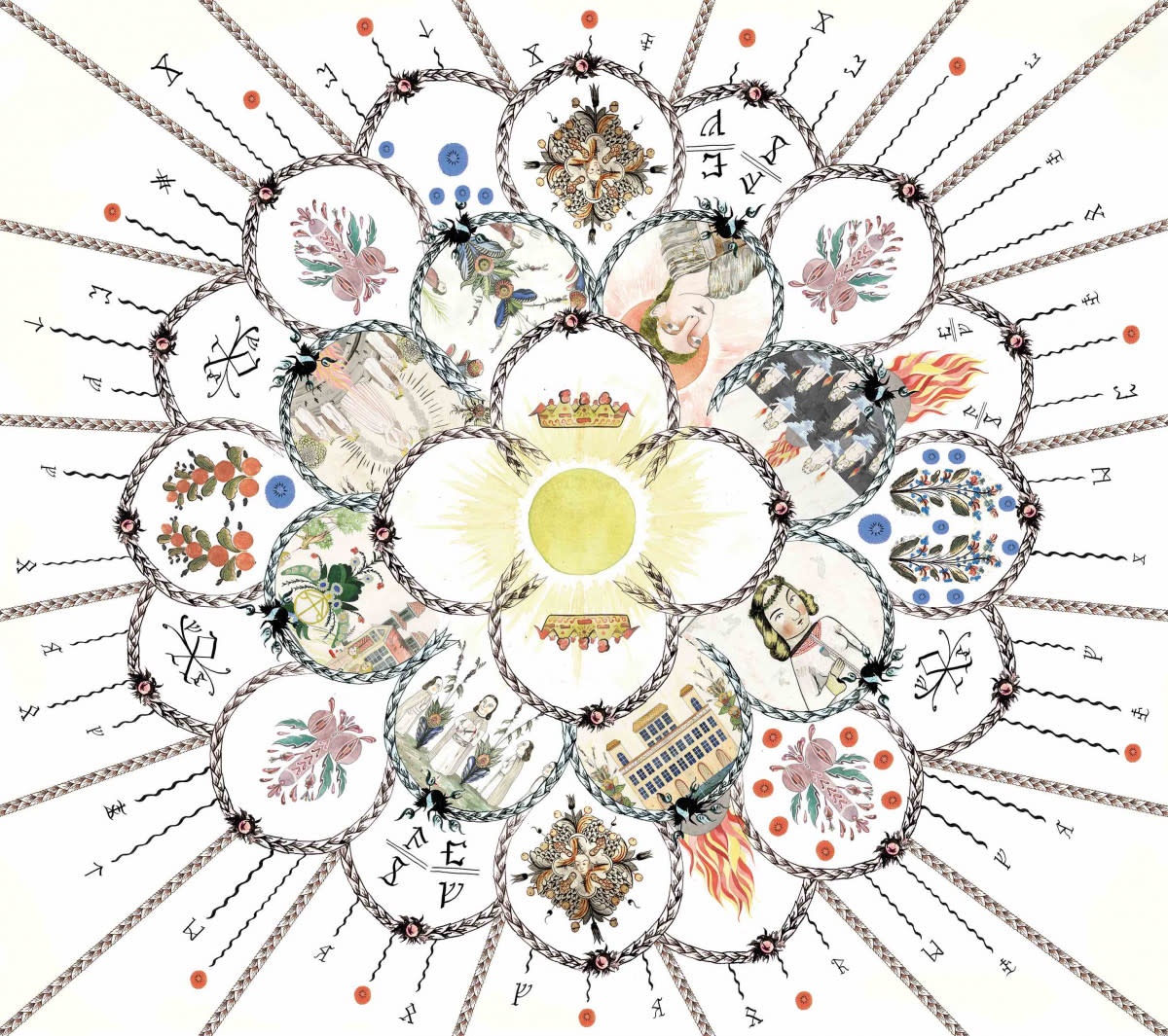
Henrik was working his ass off creating the set on-site while Ragnar and I started designing these huge floor-to-ceiling murals. From the beginning I had several ambitious ideas for how detailed and conceptual they should be, and at one point I envisioned a kind of ”mayan calendar” layout, but they weren’t possible from a practical perspective being only the two of us working on the actual art. I don't think people, even in the industry, realize what an extraordinary feat it was for the production team to get this film together. Luckily Ari, Pawel (Pogorzelski, director of photography) and Henrik had blocked out most of the shots already, so we could ”cheat” a little bit from a shot-perspective. So I went through the script and just underlined everything that is mentioned I felt could be part of the Hårgan lore. I gave it to Ragnar and said ‘do as many images as you can’. We also agreed with Henrik and Ari that some images should be prophetic, and it all came together nicely because for the Hårgas, history and future are the same. Their culture is cyclical so events that happen now have happened before, and will happen again.
Martin Kalqvist, the Swedish consultant on the film, created something called the ‘Affect Language’ — a mode of communication referenced heavily in the script. Can you talk about bringing this non-visual mode of communication to life?
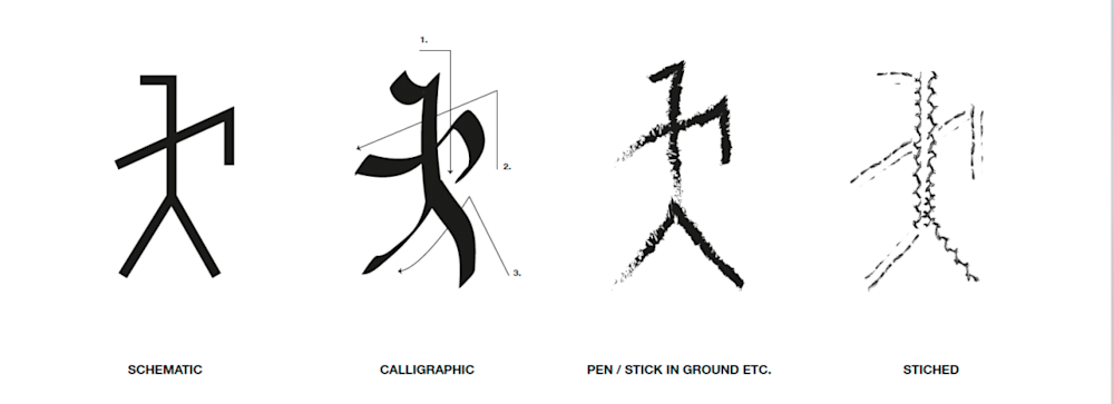
The Affect Language is how the Hårgas are emotionally attached to each other and how they keep their community together. It’s a spoken language, a physical langage, and a runic system. And above all, a kind of mental empathic connectedness.
Martin created an extremely detailed universe where the Hårgas had a history going back hundreds of years. Something I learned working on this film is that in order to make something plausible you need to have that seemingly redundant background information. It helps answer every question: ‘how would they do this?’ ‘how would this look?’ ‘what materials would be used’? It doesn’t push the story, but it creates credibility and coherency in the production on a subtle but crucial level.
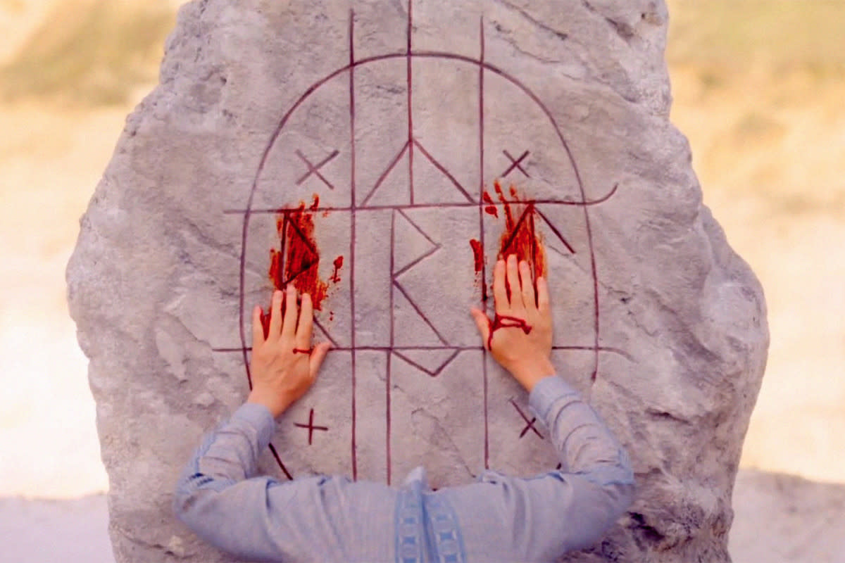
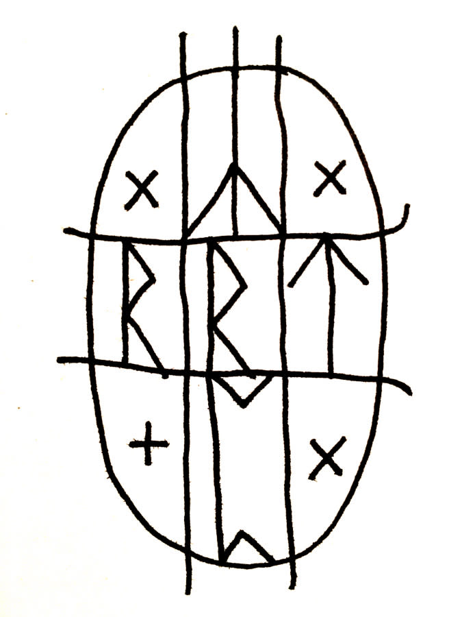
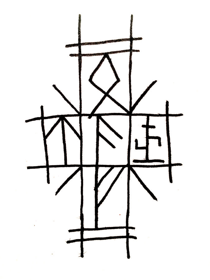
In the beginning I started thinking about how you could develop a runic system for the Hårgas that wasn't ”viking runes”. We had a meeting with the choreographer on the film Anna Vnuk, and she sent me some YouTube clips from her Midsommar workshops, where she developed [the Hårgas’] movement and dances. I thought there were some interesting arm movements that looked a bit like calligraphy, so we used that to develop the alphabet system. It made sense that the characters would allude to both wording and movement, since the affect language sort of exists on both symbolic and performative levels.
The affect language is also about their physical interconnection. The way they breathe — ‘ho-ha’ — is like saying ‘I see you’. You see it when the women start crying with Dani, it’s the first indication she’s becoming one of them. She is directly affecting their mental states. She is becoming part of the beehive mind. At least that's how I see it.
The Hårgas pull from a wide variety of mythologies as part of their belief system too. How far and wide did you research to built up their visual amalgamation?
For my work I concentrated mostly on research of the Hälsinge folklore as well as Sámi culture of Northern Scandinavia. At one point Ari wanted it to be more global so we looked at elements from Native American spirituality to Balinese influences. He had been doing a very wide research on cults and cult behaviour in general. But I didn't really pull that off, it ended up looking more watered down to some kind of derivative new age mix up. So we went back to more ”scandinavian”. At least for the older elements of the Hårgan culture.
The arch (that the visitors enter from) and the Fire Temple at the end look different because they’re newer — the culture permeates along the way.
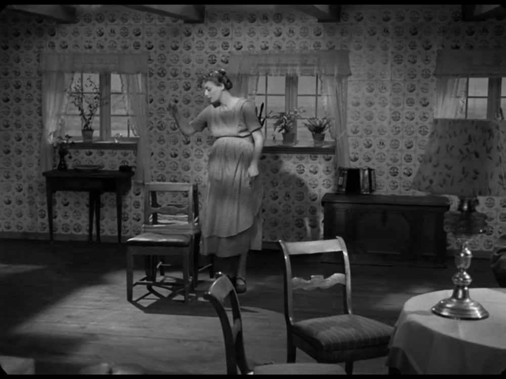
On that note, colour plays a huge role in the film but one of the more striking set-pieces is the house of Siv, which is all black and white.
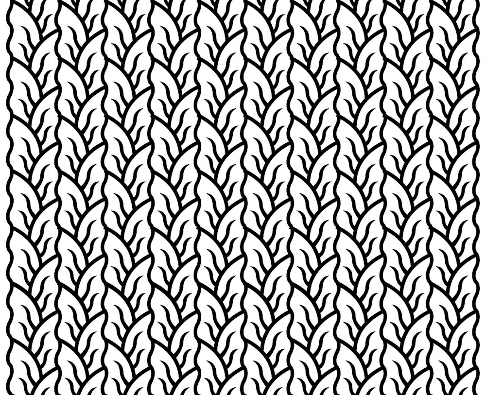
That’s the interior I was most pleased with because it’s between very traditional and something you haven’t really seen before. Henrik had done so much preparation that I think Ari was very comfortable where everything was going and didn't instruct us much at all. But he had one reference image from the Danish film ”Ordet” of an interior of a Danish house he was really into. The interior was made of tiles, very graphic, which to me is much more central european aesthetics. But then as I was looking through some books on Halsinge paintings I came across one image where instead of wallpaper they painted repeating patterns directly on the walls with stencils.
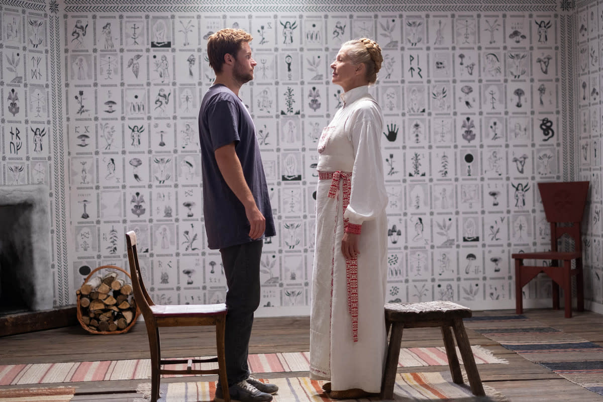
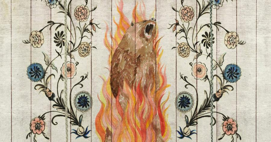
The original design was probably in vivid colours but the photograph in the book was black and white so the design had a fantastic graphic quality. Then I realized we could sort of fuse it together and create a visually very specific look for Sivs house that had the same quality as Aris reference, but made from Halsinge aesthetics. So Ragnar did tonnes of drawings and I did lots of scribbles, frames and the stencil system for the walls and ceilings. We lifted some motifs from the big house for continuity. We programmed a system where everything fit around the walls and Siv herself. And also included the image of the burning bear which was mentioned in the script. They were printed really thin and glued to the walls, but because the paper was so thin the woodgrain came through, so it looks like it’s stuck on the wood. My secret dream now is for me and Ragnar to do a real interior design gig from all the patterns and ornaments we’ve created.
Something else that stuck out to me, from a production design perspective, was the role symmetry and mirrors play in the film. Did that overarching visual language find its way into your work?
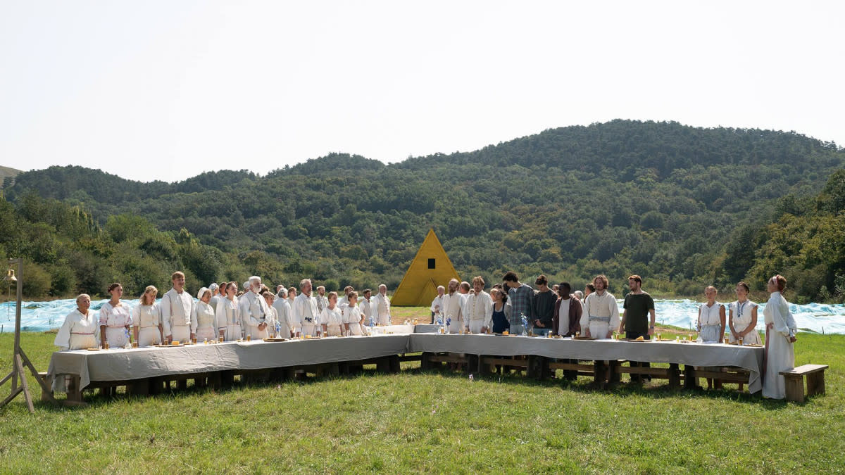
There were some elements: Take the dining tables for example: in the beginning we helped with design ideas for the food, the table settings, the cutlery etc. the idea being that it would be different every time they shared a meal. But that became difficult considering how many different sets there would have to be, so instead it was decided to organise the tables into different shapes, and shoot it from above while keeping the arrangements on the tables quite simple. Which in the end I think ended up much more effective and ritual-looking, if that's a word. And the wall decorations throughout are designed with a cathedral like symmetry. Just the ceiling alone took ages to design and is visible maybe three seconds in the final cut … love that kind of overkill and I am positive it is needed if you want to create something worth while.
For the most part, Ari and Pawel took care of the shots, we were just concentrating on putting stuff in the background so to speak. But occasionally we did discuss how the different shots would look like and be framed and at one point we discussed the possibility of making shots and murals even more parallel which would have been effective creating almost transitions between illustrations and footage and perhaps making the ”fate-machinery” in play more obvious. I think I had some memory of Peter Greenaways ”Draughtmans Contract” in my head. But the production really did not allow the amount of planning and control that would have been required. And maybe it would have been cheesy and too obvious, who knows? But all the time, it was very clear to all of us that it would be a film with high visual ambitions so to speak, and I am very happy and proud to have contributed to that.
Midsommar is out now on DVD