Isle of Dogs: Designing the details
When Wes Anderson asks you to help design his most visually ambitious film yet, you better be ready to worry about the details. At least that's what graphic designer Erica Dorn did while leading the design team behind the Japanese retro-futuristic world of Isle of Dogs, Anderson's directorial follow up to The Grand Budapest Hotel.
Hi Erica! First of all, can you give us some background on your practice and personal style?
I grew up in Japan, so I don’t know if that has something to do with it, but I’m very much drawn to simplicity. I like elegant solutions – when every element is there for a reason, and everything has a purpose. I dislike decoration unless it’s deeply meaningful — like any artwork I have in my flat has to be from someone I have worked with or admire. Having said that, I’m not a pure minimalist either. I like work that has warmth and personality, and texture.
Prior to this film you had done quite a bit of work for fashion houses like Hermes and Louis Vuitton — did that style naturally lead you to work on high-end branding?
My first full-time job was at Winkreative, who are known for their clients in the luxury space but also for their work on transport, cities, governments, retail and hospitality. Storytelling is one of Wink’s greatest strengths, really getting to the core of a client’s raison d’être and communicating that through design and art direction – whether through graphic design, photography, short films, spatial design, or illustration. I participated in the Hermes and Louis Vuitton projects as an illustrator too, but in a completely new style each time — I think it’s really refreshing to be able to do that.
I don’t think as designers we should hold on to a personal style. If we’re doing our job well, we’re reinventing our style for every client so that it’s unique and appropriate to them.
Erica Dorn
OK, let's talk about the film. What was the design research process like for both yourself and Wes?
A lot of Wes' inspiration came from mid-century Japanese cinema. And Paul Harrod, the production designer I worked with on-site in London, was so knowledgeable about the genre. He’d seen everything from that period; Kurosawa and Ozu being the main [references]. We returned to these time and time again for graphic details like shop signage, wallpaper and bookshelves. We also built up a library of details from that same period for each prop — mainly 60’s and 70s, but it was never really strictly defined. For some props, Wes wanted to see older references, and for others, much newer. This was particularly true for electronics and gadgets as a lot of [these references] were from the early 80s.
Wes and the production designers also looked at a lot of Ukiyo-e prints from the Edo period [1603-1868] as inspiration for their landscapes, and looked to the brutalist style of the Metabolists for architecture.
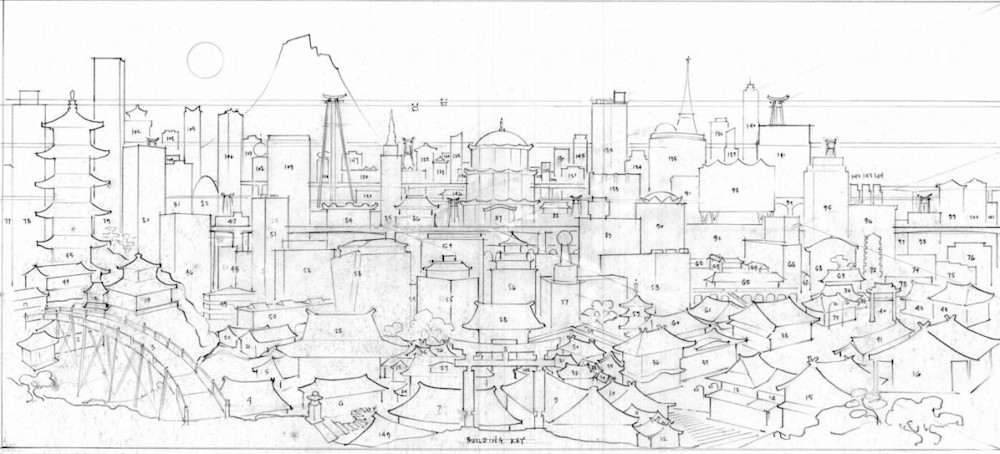
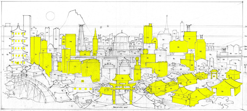
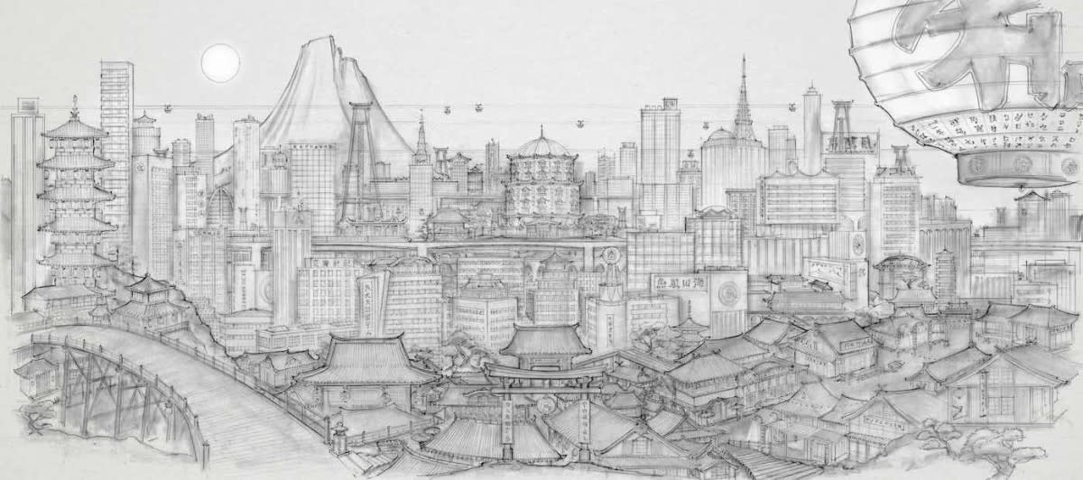
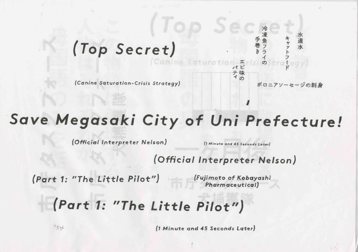
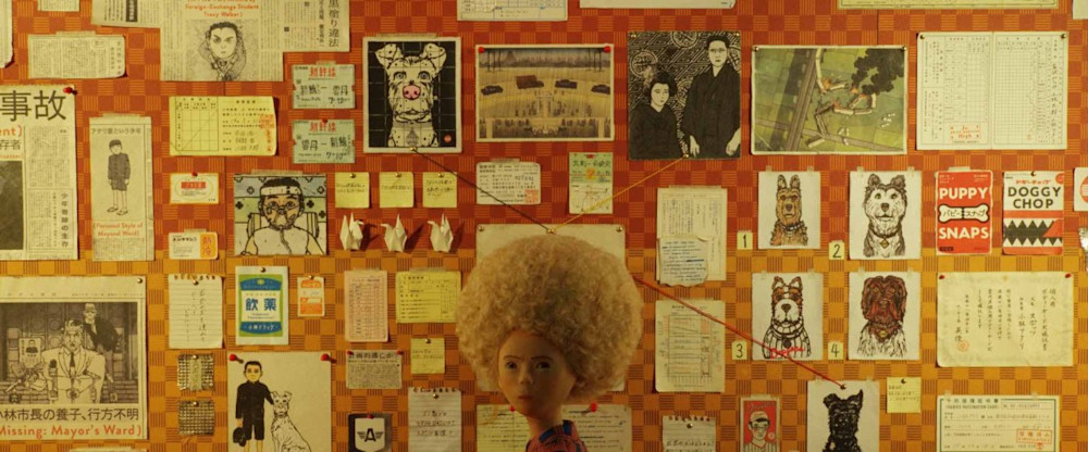
The city of Megasaki (where much of the film is set) has a really unique visual personality. How did you go about building an immersive look and feel for an entire metropolis?
The process for each set starts with Wes and the production designers coming up with a concept and visual references. Then there is a concept artist who takes those ideas and puts them onto paper. This is where the magic happens — it’s almost like a print-out of Wes’s imagined world, and it’s really helpful for us.
We then need to fill in the typographic details that are missing (see illustrations below), working from real references as much as possible. The more graphics we got through, the more Megasaki started to feel real and familiar. I think that’s why the details are so important — when you’re telling a story about a fictional place, the details need to come from reality in order for that place to feel real.
Here’s a breakdown of our process:
1. When we (the graphics department) start on a new set, we check the script, the concept art, the animatic (moving storyboard), and the reference images that have been collected for that set, plus old notes from Wes that have been archived by the script supervisor.
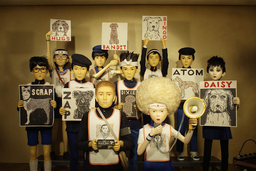
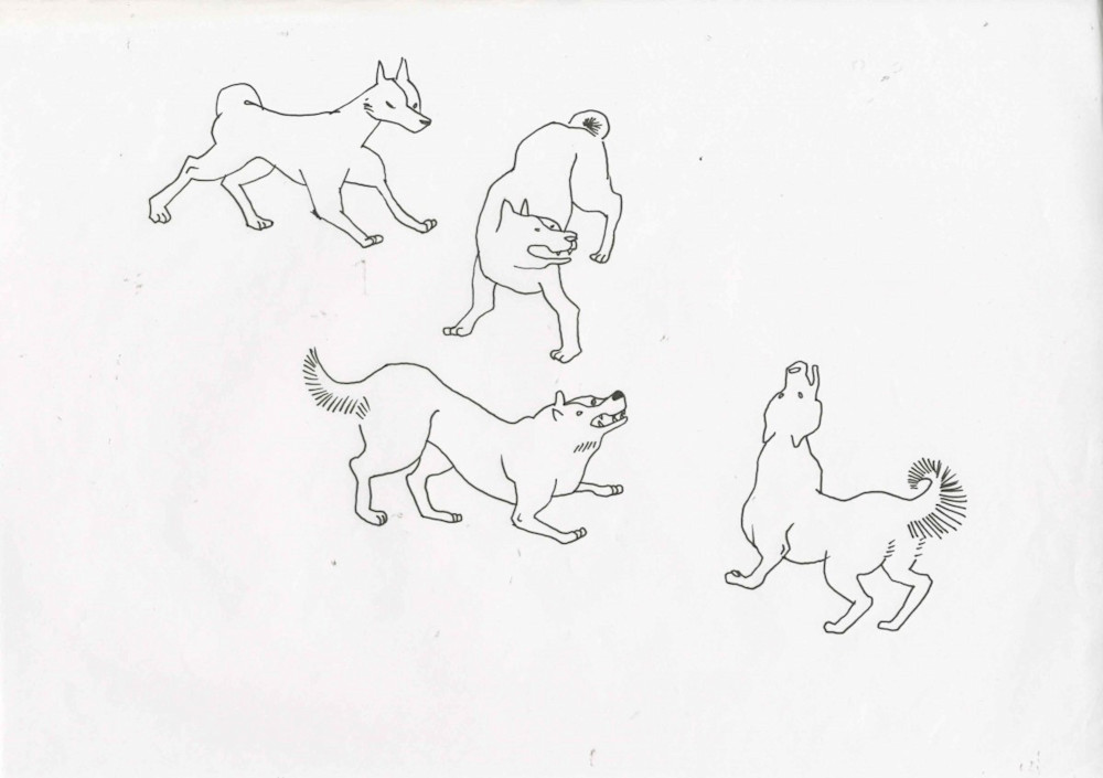
2. We then make a list of graphics that will be required, then just go down the list. If we're up against time, we’d spread out the tasks among the team — at our busiest, we had four Japanese-speaking designers, another who was very good at making patterns, a paper and printing expert and also a woodblock artist and illustrator who was carving all of the dog portraits (and most of the human ones too) and printing them by hand.
3. For each item on the list we collect references from the period, or from today, or older. From these Wes makes a selection and that becomes our visual brief to start designing. We try to keep as much as possible the characteristics that make the chosen references unique, like the lettering or type of paper or stamp detail.
4. Once we have the first design, it's a matter of revising back and forth with Wes until it's ready to be made into a real thing. We'll do as much of this by hand as possible, knowing that eventually it may have to be digitised and scaled down. It's then up to Wes how far he wants to deviate from the original reference — try a different colour for example.
5. If it’s a paper or card prop, we make it (print it, cut it, etc) and if it’s something more solid that needs to be built, we pass it on to the model-makers and painters.
6. Repeat the process for the rest of the items on the list. Often we'd be working on several different sets at once.
So in this respect, you’re not just a designer but a writer, storyteller, world-builder and humorist too. Do you see this as the untold role of a film's graphic design department?
In film, you don’t have a copywriter to back you up like you would in advertising or content publishing — you have to do the writing too. Luckily, my assistant Chinami and I both grew up in Japan, so a lot of it was about taking things that existed and swapping out the details.
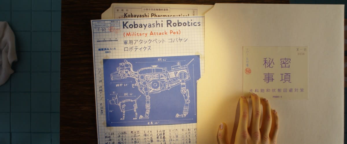
We did have fun with it though! We came up with stories about rival high school sports teams and animal abuse cases and scientific reports about the serum [taken from real references like university newspapers]. We didn’t want to make any inside jokes or puns that Wes didn’t know about, so we kept things pretty straightforward, but when I designed the sake bottles for the dog-hovel we pitched some dog-related sake names, which was fun. There was also one instance when we were making shop signs, and we thought it would be a great idea to include the name of a rice shop owned by Chinami’s family back home. And King’s tag needed a Japanese family name, so I included my mum’s — but mostly because it’s easier, legally, to clear.
Where did you grow up in Japan, and how did it influence your design for the film?
I grew up in between two very big cities, roughly 20 minutes drive to either Osaka or Kobe.
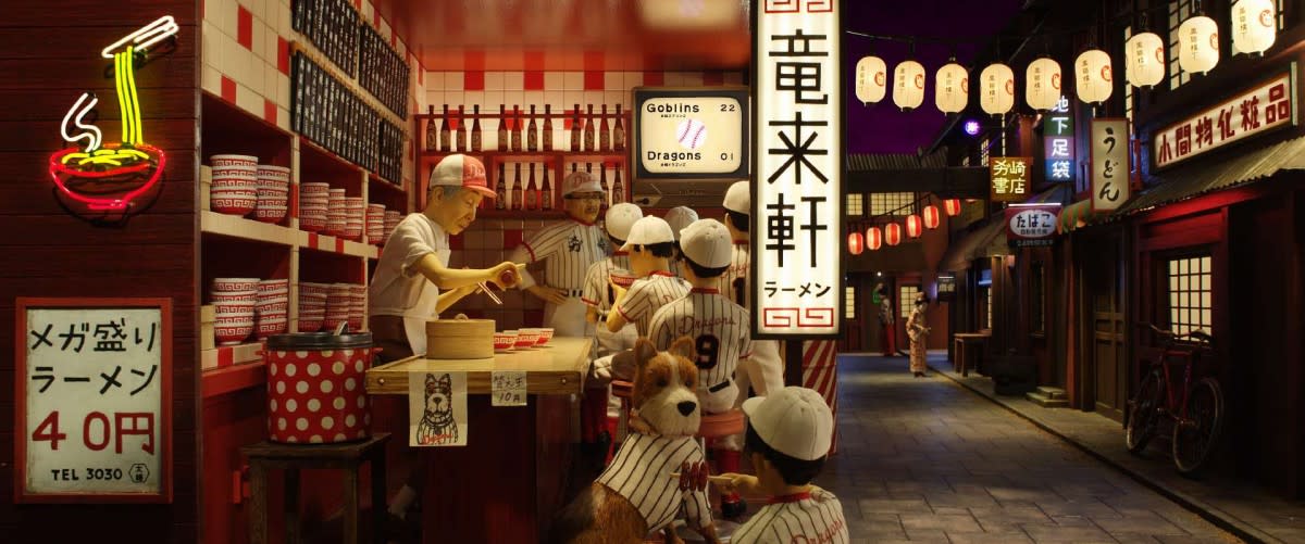
Osaka is very vibrant, very busy, and parts of it felt like downtown Megasaki, like the old noodle bars we created. In Kobe, I went to school on Rokkō Island which was actually man-made from landfill, technically like Trash Island. But it doesn't look anything like that, it's very symmetrical and manicured and organised. It's a little bit American in a way, and there's a disused waterpark just like in the film.
If Wes asked for something to be changed it would need to be done an hour ago while working on something due in three months time.
Erica Dorn
Can you give us a few examples of design detail in the film that you're particularly proud of, or things that you spent a lot of time on that people might not notice?
There are so many things that I think people might not notice! But that’s the nature of the job.
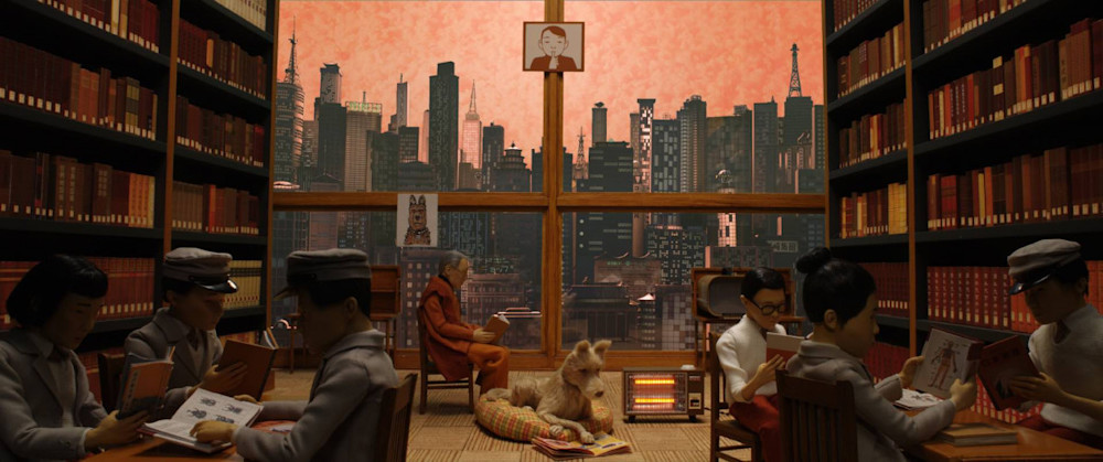
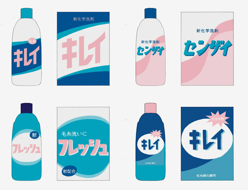
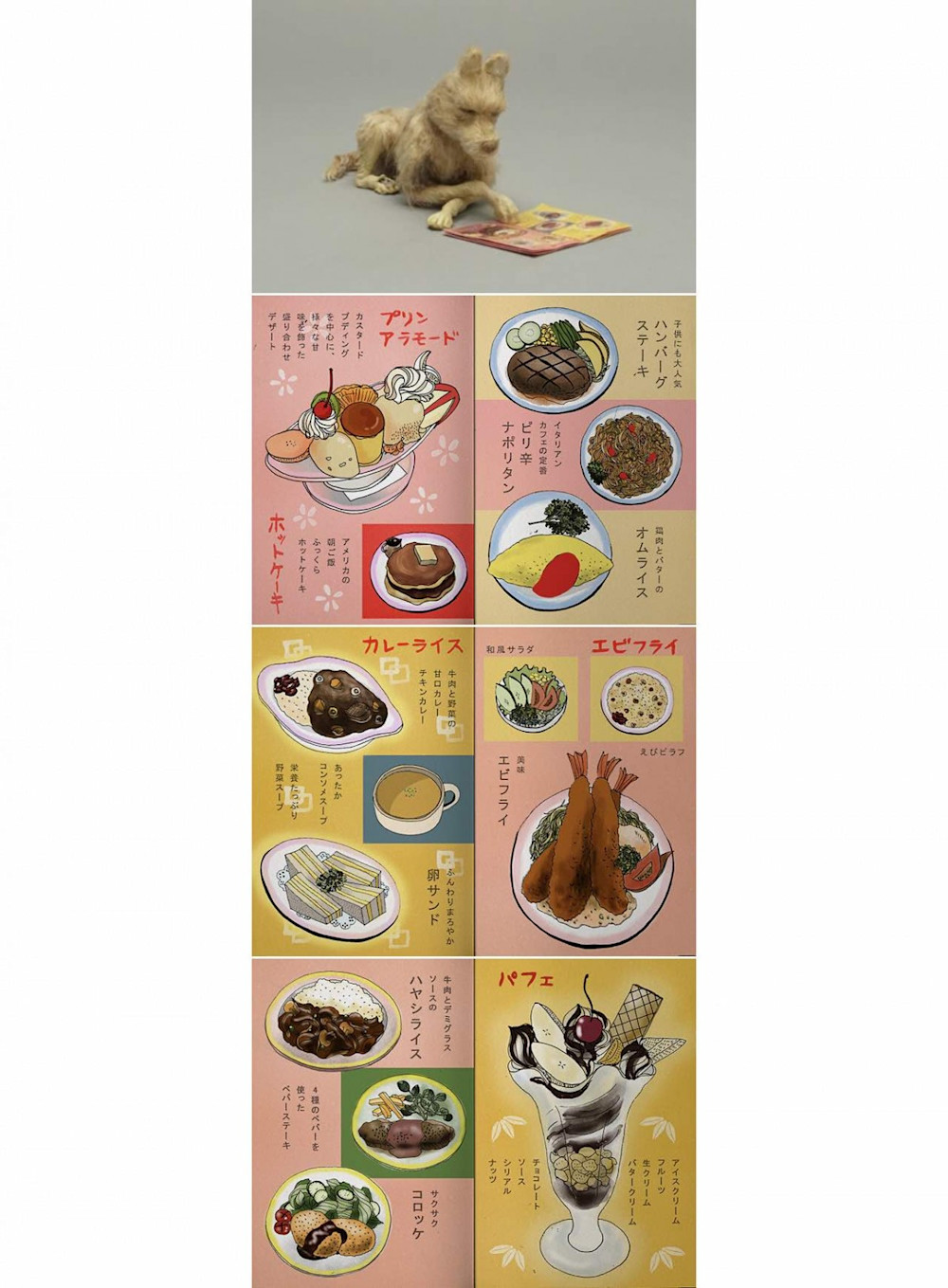
I’m a bit of a packaging nerd so I loved doing the packaging designs for things like the box of milk (in the dark), detergent packaging (blurry), whisky (split-second), the boxes in Atari’s medicine cabinet (tucked away in the corner), all of these little things that become like a background texture but are working very hard to subconsciously place you in a specific time and place, albeit not a real one. Same with the library books that the kids and Rex are reading in the denouement montage at the end — you will really need to strain to see these, but we put a lot of care into them. Rex’s picture book is one of my favourites.
The typography in scenes like the opening/closing credits is really interesting, can you talk about the process of developing type in the film?
Thank you, you are actually the first person to ask about these! We did the titles at the end, when most of the main sequences had been shot. We had done a lot of typography for the sets, and also for the chapter titles and flashback sequences so I already had something of a style guide. Wes wanted to use lots of different lettering styles for the Japanese text and keep the English constant. It made sense because in a real city you have lots of different fonts living together. The English text played more of a supporting role.
In the beginning I really was trying lots of different styles — but it quickly became clear that he was quite averse to brush script, anything with serifs, and tall condensed styles. But he would never explicitly say that — he would just ask to see something else. So we ended up with many variations of sans. In Japanese you don’t have as many fonts as in English, especially not with the full 2000 characters. And when Wes has picked a reference, let’s say a movie poster from 1962, it’s actually much easier to imitate that lettering by hand than to try to find a font that’s similar and manipulate it. And you need to be able to change it because Wes will often ask you to 'try bolder', 'more angular', and so on.
Did you have to break any of your own design rules in that process?
[Wes] is a very visual person, but he doesn’t use the same language as someone who has studied typography formally for years. He has more of a Japanese attitude to it, which is that you can push or pull text. Normally this is sacrosanct, but in Japan, we do that more freely because we treat type more like an image than text.
He is also someone whose references are from an era before graphic design was digitised, so he instinctively rejects anything that looks too perfectly kerned or aligned.
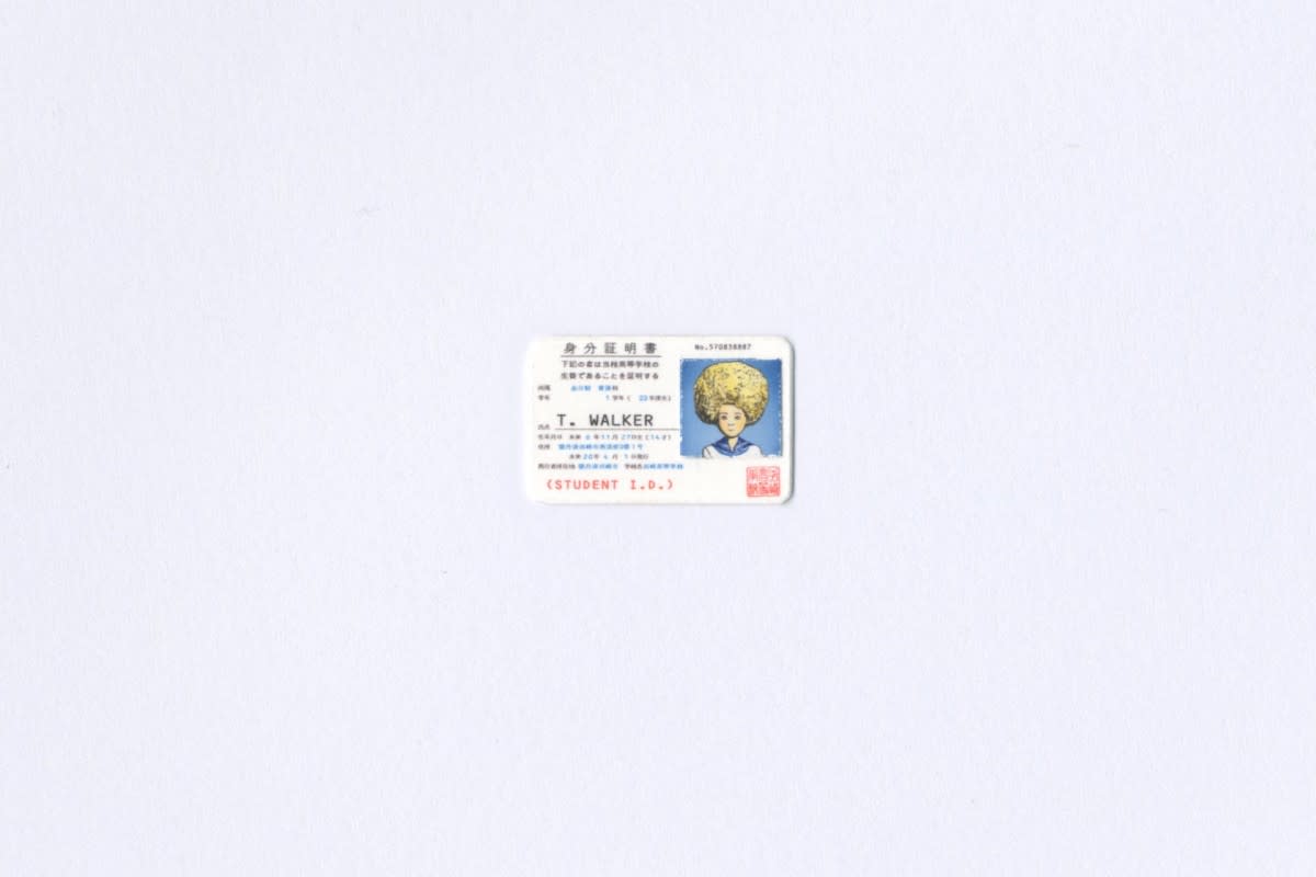
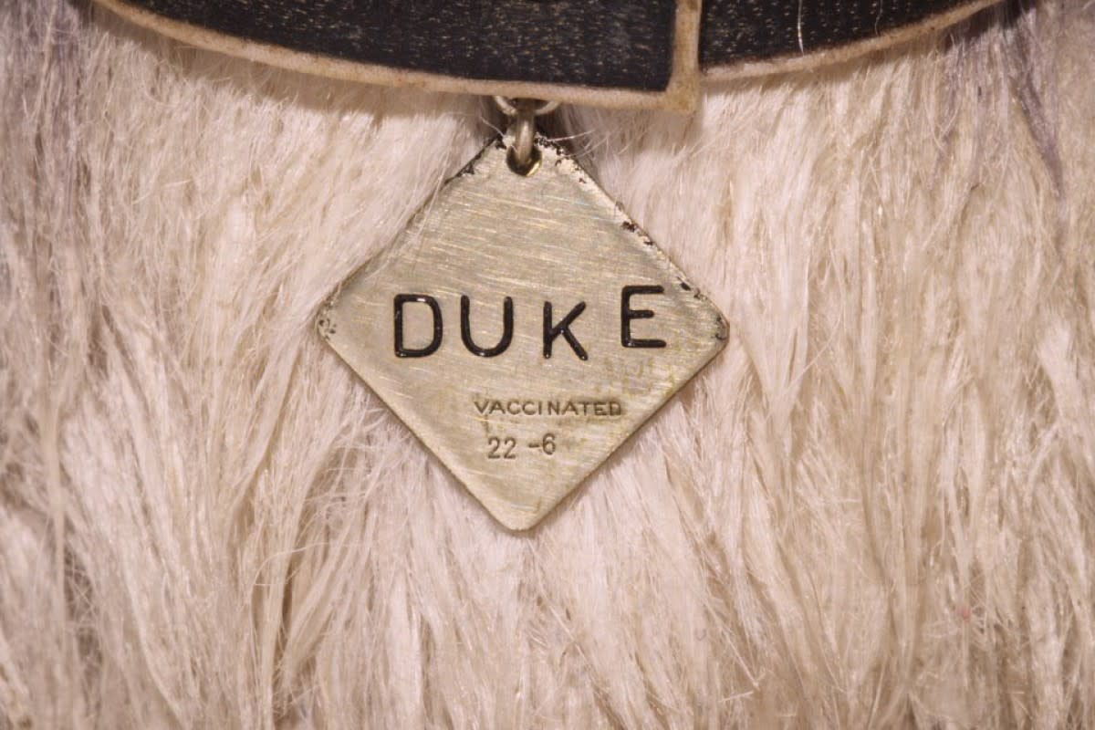
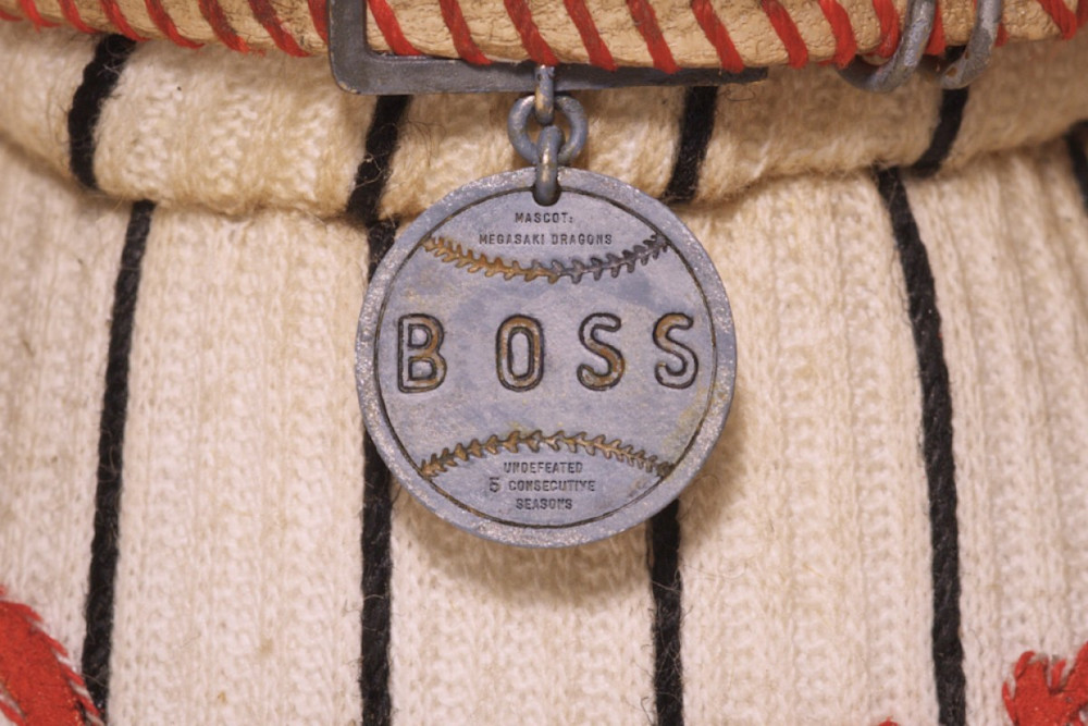
On Duke's dog tag the 'E' is too high up and far from the other letters because you're trying to recreate a mechanically engraved typographic error that might occur naturally. So you need to unlearn the principles of correct typography and just get more hands-on.
Erica Dorn
Now if I was doing another film I'd try and keep more of the hand-drawn lines or painted textures because I realised how much character and personality that adds to your work. For example, the English text used to be a font, right until the end of post-production when Wes said 'well all the Japanese is hand-drawn, let's do the English by hand then'. By that point there were hundreds of subtitles designed, so I traced the whole alphabet three times, then asked the font designer to type it into a font so we could type it out instead of hand-drawing all the scenes again. That font was then used for the end titles too. It became the signature.
How far ahead of the production team were you working?
Usually graphics start before shooting, where you would have a prep period of between six weeks to two months. For us, it was six months. There was a lot of prep to do. When they start shooting you carry on working, but at that point, you're making graphics for what they're going to shoot later.
We were based on-site in a film studio called 3 Mills in East London. It's arranged like a giant airport hanger split into 20-30 booths, and inside each one was a set with an animator working on that set. They're all at different stages: some are empty, some are being set-up, some are being dressed with props and final touches, and some have puppets in place for animation. The schedule is so complicated and we had coordinators helping with that, but we had to be constantly on top of what was being shot and what was about to be shot, and if Wes asked for something to be changed it would need to be done an hour ago while working on something due in three months time. So a lot of the job is keeping track of that, being super organised and working with a team where everyone has something to do all the time.
I read you served as an 'unofficial cultural consultant' for the film — what did this entail and can you talk about some of the challenges you had to solve?
Like I mentioned earlier, my assistant designer Chinami and I used our experiences of having grown up in Japan to inform design choices. Because we were on-site, that kind of knowledge was also useful outside of the art department. So it was also up to us to pick up on things like if collars on the kimonos were on the wrong way around, or that the puppets were holding the chopsticks correctly, and that they were writing in the right direction, following the correct stroke order, etc.
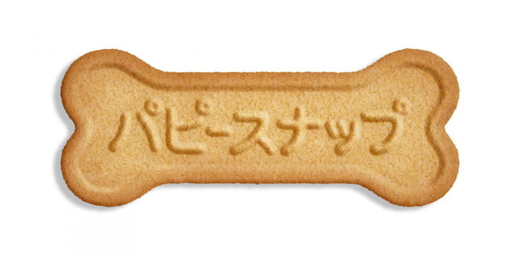
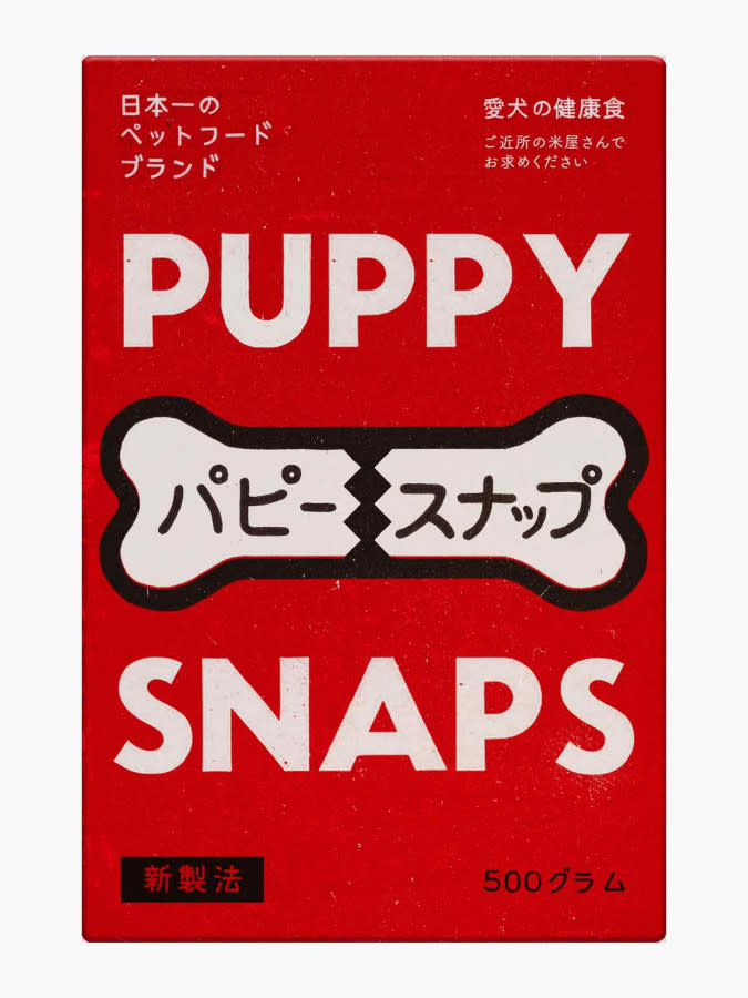
There is a really strong sense of branding in the film — items like Puppy Snaps and how they're integral to the plot of the film. How did your design experience in advertising for brands influence your work on the film?
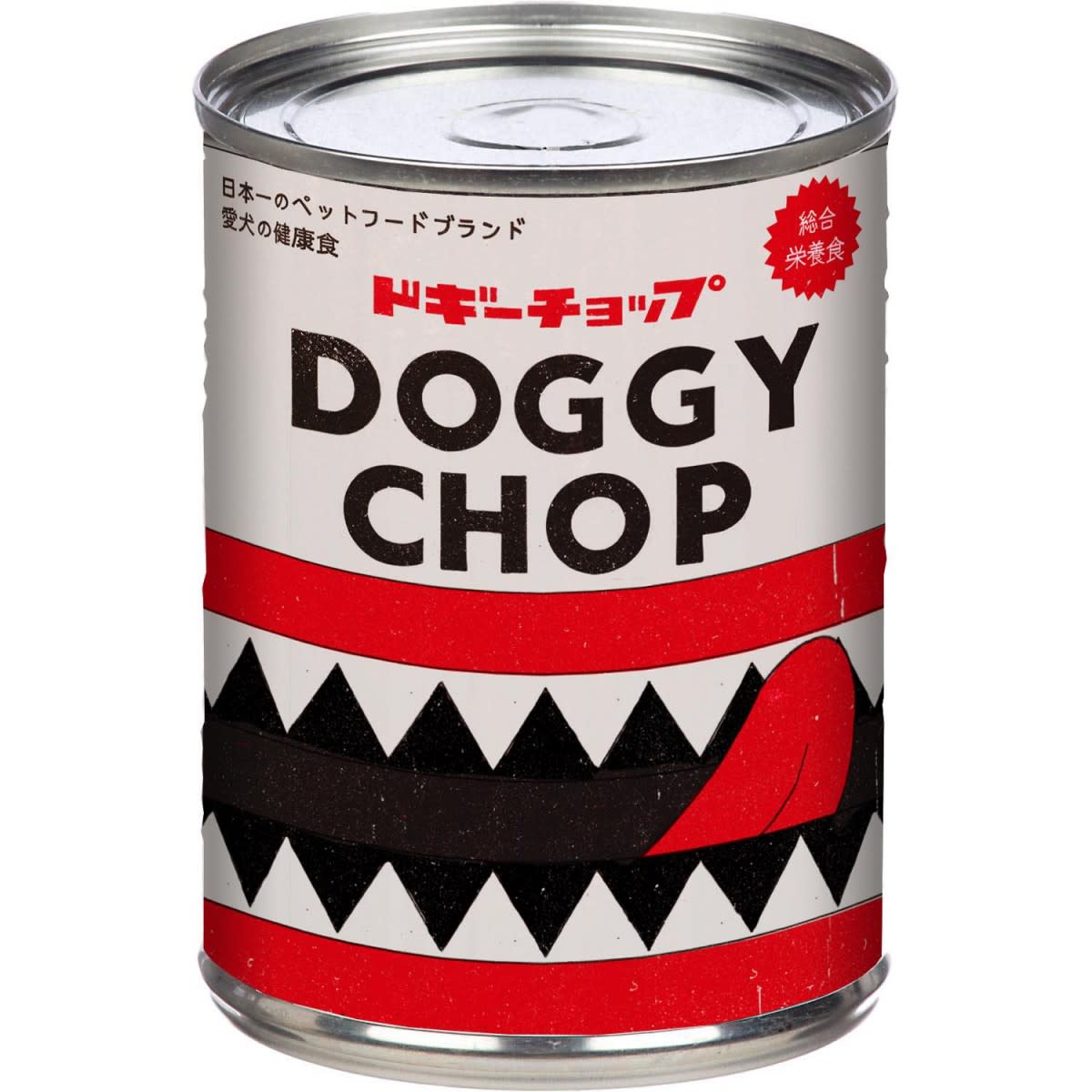
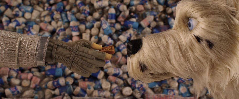
Puppy Snaps, Doggy Chop and Hokusai beer are all brands that were invented by Wes and the co-writers and scripted into the story. Puppy Snaps features in a very emotional moment when Atari ceremoniously gives half of the biscuit he brought for his own dog to Chief. There’s something almost sacred about it and it represents a new bond between the boy and 'his' dog. It would be an amazing product placement if the brand was real. This is the sort of emotional storytelling that is so important for brands to get right, beyond advertising why the biscuit is healthy or popular or good value for money.
Doggy Chop swings from prosperity to bankruptcy and back, almost like a social barometer for the city’s collective acceptance and rejection of their pets. And Hokusai beer — well that was just a bit of fun I think, a sort of tribute to the great woodblock artist. It’s nice to have our own beer brand for Megasaki, sort of like Orion in Okinawa. If you look closely you’ll see it everywhere, from billboards to branded lanterns in the alley, and vending machines.
Is that hand-drawn approach the way forward for brands IRL too?
It depends on the brand! If it's consumer-facing and wants to appear friendly and convey a human-ness to communications, it's definitely helpful.
What’s next for you?
I'd like to stay in film and catch up on the specific skills that film designers have that I haven't necessarily picked up. Most graphic designers for film start as art department assistants, so by the time they get on set they have good knowledge of how films and sets work. With this project, I might have jumped the queue a little bit. Every day was a crash course in something new, and I'm sure whatever film or TV show or commercial I do next will be a whole new set of knowledge to pick up because each project is a new, different world.
There's a lot of learning, or re-learning, for me to do.
All images supplied by Erica Dorn © Fox Searchlight Pictures.