Visual editor Tracy Ma talks power and style

Tracy Ma has built a career out of dismantling the visual world around us. In her time as deputy creative director at Bloomberg Businessweek she paired journalism from Wall Street’s finest with the kaleidoscopic turbulence of Victor Miscoso; her role as creative director at Matter Studios is best summed by an exploration of power structures via the darkest depths of the tumblr archive; and in her current job as visual editor of the New York Times’ Styles desk, she designs safe passage for diverse voices across fashion, sex, drugs, death, glitter, celebrity and the optics of our time. No easy feat, right?
Hi Tracy! Tell us a bit about the Styles desk at the Times.
It’s changed a lot since being called the 'Female Pages' back in the day. Our editor, Choire Sicha (pronounced Cory Seek-uh, who was one of the founding editors of Gawker and founded The Awl) came on board a year before I started and really set out to redefine what Styles meant from both the organisation’s perspective and that of the changing times for the general public.
So it’s about changes in attitudes; how we talk about gender, bridging the generational divide, critiquing consumer culture and the greater implications of materialism. And then of course celebrities and sex and gossip.
Is that an overwhelming platform to design for? Not just because of the subject matter, but because of the number of voices you need to represent and the historical context of the Times too.
Not so much, largely because of the way the company is structured. There’s really no penultimate decision maker or higher power. I have a strong voice and style just on my own, but it’s not as though I feel like we need to cover capitalism with this critical, aesthetic eye.
You once said you preferred to work in media because editors could build a long-term relationship with a reader. Do you think a visual editor can do the same thing?
Oh yeah, absolutely. I’ve never felt the need to create ‘beautiful work’ or sleek-looking things. I’ve always been interested in identifying an aesthetic or way of looking at things that people can decode and then process because they get the joke. Design is a mode of communication with people, especially considering the way visuals transfer on the internet like it does in meme culture. I would hope my work fits into that somehow, where people see the way I’m designing for a subject and understand how to talk about it visually.
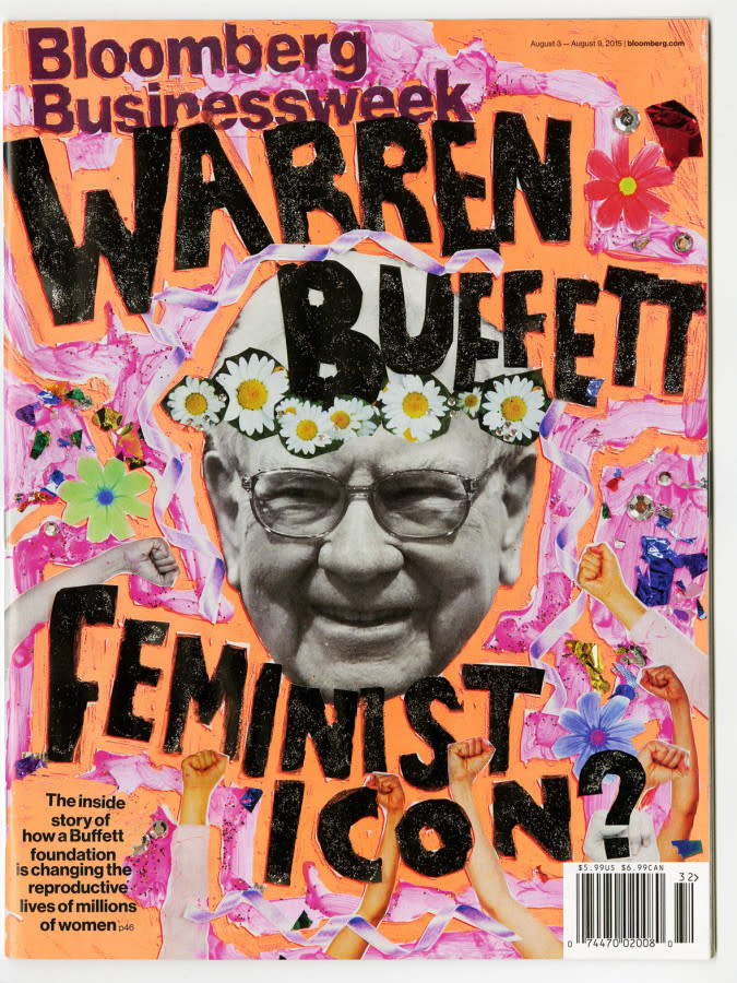
Looking at the lineage of designers at Bloomberg Businessweek, there seems to be an ‘anti-design’ undercurrent throughout. Was that just a Businessweek thing or was it part of a broader trend?
Businessweek had a huge impact on a lot of us for a multitude of reasons, but at its core was a beautifully designed magazine. It had a really nice Swiss grid built by some British people who are great at grids, so our job was to create tension on top of that; developing ways of image-making that informed the way we’d learn and talk to each other. I don’t think we were out to ‘get’ beautiful design. It was just that we had a beautiful grid in a beautiful office and if we didn’t create any tension it would have been far too boring.
I really loved the recent expose of the glitter industry that was recently published in Styles, particularly the photography by Chris Maggio. As a visual editor, what’s your process for choosing collaborators?
I think there’s just this momentum of internet weirdos who study kitsch as a theme in their work. Chris Maggio is someone I’ve followed for a while and knew a little bit IRL; I’d showed his work to [photo editor] Eve Lyons. At the same time, Caity Weaver had just been hired by Choire; we knew her writing style, the subject matter (the origins of kitsch) felt right for Chris Maggio and so the two were paired together quite naturally.
When it comes to longer features, sometimes you’ll get a pitch from a writer and think ‘oh yeah, this will be good’. For those pieces you have quite a lot of time to find the right visual collaborators. For other pieces (like the “Royal Wedding FAQ”) we had to create the design-form first, then assign writers to help bring that to life. There are different ways into different topics. Then there are those quick news stories (like Jeff Bezos’ divorce scandal) where we have one day to do it, so we’d use some garbage graphic design to make that interesting.
There’s a dark humour to your work that plays on the insecurity of your subjects. Is there pressure to offer that level of satire in every piece?
I find playfulness a huge burden. When I taught at Parson’s I’d ask my students ‘why did you make this type so wobbly?’ and they would say ‘oh, because it’s playful’ and it’s just this buzzword. In terms of humour and copywriting, that’s the stuff I want to consume and pursue; a lot of it comes from talking to Choire, and a lot of it comes from me being bored at work and wanting to make my co-workers laugh.
Tell me more about teaching at Parsons.
It taught me a lot of things: one being that I love to create but I don’t have the muscle to teach. It’s not really about patience, but being able to unlearn how you did something and then learn it again; to express and articulate. I’d consider myself self-taught so I didn’t know how I knew anything. Design is a series of decisions you make and it’s very hard to deconstruct that to a teachable format.
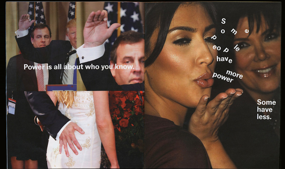
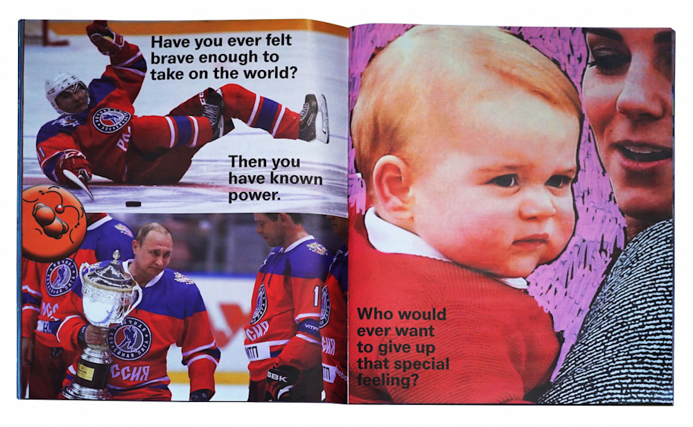
The Matter Studios project, Total Power Move, featured a huge bank of internet-era images that must have required a huge volume of cultural knowledge to access at any one time. What is your archival process like?
Emily Keegin was the photo editor on that project and if I had unlimited resources I would go to her for anything. She has one of those brains that makes connections with all sorts of stuff and has always been very curious. I met her at Businessweek and she’s one of my closest friends; she works with photography at The Fader but doesn’t get to do photo research herself, and it’s very rare to meet someone who loves photo research. My love for photo research came from watching her work and the kind of stuff she’s able to find. That project was very rewarding as a chance to dig through the archives.
I think you need those extremely online friends who have access to the deeper corners of the online archive. Where do you go to find the good stuff?
I’m not great at it. My best friend, Steph Davidson (who is still designing for Businessweek), is so deep in Tumblr. She’d always G-Chat me links and have me dying of laughter. I think they hired her once because she’s Tumblr famous. So that’s a major source. I tend to go into Instagram illustrator holes and not realise who I’m even looking at anymore too. I should put them all into a spreadsheet.
There was that image recently demonstrating how every luxury fashion house has adopted essentially the exact same logo-type. Do you think the Styles desk has any say over trends and how they’re dissected?
I don’t think this institution has power over that. I’m actually not sure where that obsession with mid-century industrial age typography came from.
If anything, I’d say Businessweek had more of an impact as one of the first publications to lean completely into Helvetica as we now have all these grotesque typefaces being used for fashion houses. Businessweek also had a role in popularising the commercial typeface ‘Druk’. When we requested Christian [Schwartz] and Paul [Barnes] from Commercial Type cut it for us, we had no idea it would turn into this complete fuccboi aesthetic. I’m glad to not be using it anymore.
Paula Scher once called New York a city of typography. Do you feel that sense of localised chaos imprinting onto your work?
Yeah, and I love it. Chris Maggio just did a shoot for us where he incorporated a lot of deli signage and street vernacular. As a photographer, he has a better eye for those types of things and I love the things he finds for everyone else to pay attention to. Those photographs really drudged up some typography questions. I feel like I’m desensitised to it.